


Picker Fields
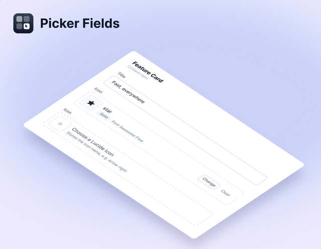
Swap the plain text box for a picker: browse Lucide, Heroicons, Font Awesome and Simple Icons visually, or choose colors by hex or name. Editors pick, and your front end gets the exact value it expects.
- Utilities
No more guessing whether it's arrow-right or ArrowRight
Icons and colors usually end up in a plain text box, with the editor expected to remember the exact value. One typo and the icon is gone. Picker Fields replaces the box with a picker that writes the right value every time.
What you can do
- Four icon libraries: Lucide, Heroicons, Font Awesome Free and Simple Icons (brand logos), each with a visual browser and search.
- Hex color picker: a saturation square, hue slider and text box, plus an eyedropper in Chromium browsers.
- Named color picker: the 148 CSS named colors, ordered by appearance so you find them by eye. The manifest also says it can use your own named tokens.
- Plain text values: every field stores a plain string, never JSON, so you can use the value directly or switch to a text field without migrating content.
Who it's for
Design-system teams and marketers who set icons and colors on components, and developers who want those values to be valid by construction. Check each brand's guidelines before publishing a Simple Icons logo.
There's nothing to configure. Install it and the six fields are ready; the docs show how to render icons and colors.
Get started
- Open Apps In Agility, go to Settings → Apps. You need to be an administrator.
- Install the app Click Install, search for Picker Fields, select it and click Continue.
- Finish Click Finish. There is no configuration step, and the six fields are available straight away.
- Add a field In a content or component model, add a custom field and choose an icon or color picker.
- Render the value Use the stored string directly. The docs show how to render Lucide icons in Next.js.
Screenshots
Overview
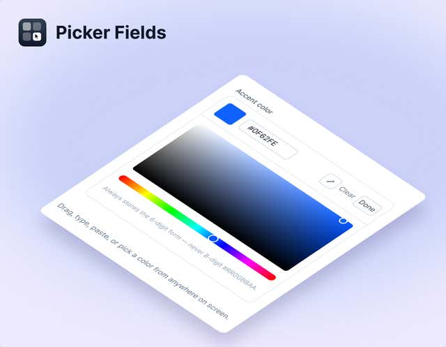
HEX Color Picker
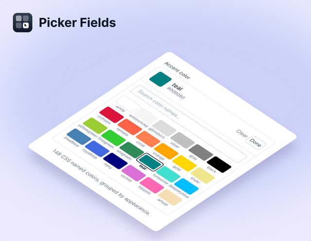
Named Color Picker
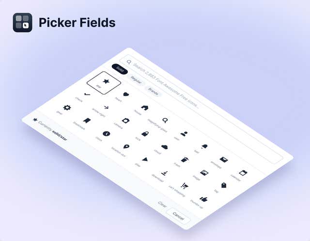
Icon Browser
Icon Field