What is your developer-dependent CMS actually costing you? Calculate your costs and get a full report


Marketplace Apps
Picker Fields
Six custom fields for picking icons and colors. Browse and search four icon libraries, or pick a color visually. Every field stores a plain text value.
The Picker Fields app brings 6 new field types to Agility: icon pickers for four icon libraries, plus a hex color picker and a named color picker.
What is the Picker Fields app?
Picker Fields adds six field types to your Content Models and Page Modules:
- Icon — Lucide
- Icon — Heroicons
- Icon — Font Awesome
- Icon — Simple Icons (brands)
- Color — Hex
- Color — Named
Icons and colors usually end up in a plain text box, with the editor expected to remember that the value is arrow-right and not arrow_right or ArrowRight. These fields replace that box with a picker: editors browse and search the library visually, and the field writes the exact value your front end expects.
There is nothing to configure. The app has no settings and no API keys — install it and the six fields are available.
Installing the Picker Fields App
In order to use an App in Agility, you need to install it in your instance. You can do this from the Marketplace under Settings > Apps. You need to be an administrator on the instance to install an app.
- Navigate to Settings > Apps
- Click Install
- Type Picker Fields into the search box, then select the Picker Fields app
- Review the app details, then click Continue
- Click Finish
There is no configuration step, because the app has no settings. The six field types are available immediately for use in your Content Models and Page Modules.
Using the Picker Fields App
After installing the Picker Fields App, you can create Content Models or Page Modules that use any of the six field types it provides.
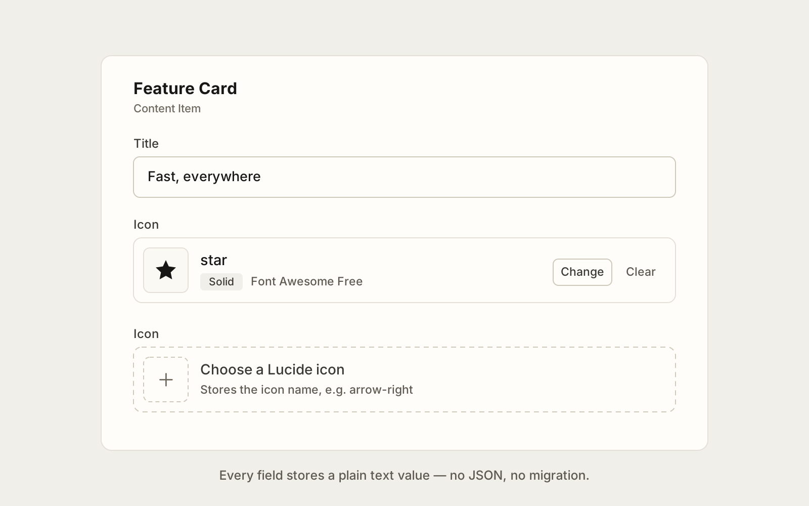
Each icon field opens a browser showing every icon in its library, with search and — for libraries that have styles — a filter for the style. Font Awesome carries over 2,800 icons and Simple Icons over 3,400, so search is the fastest way in. The selected icon is shown in the field, and can be cleared at any time.
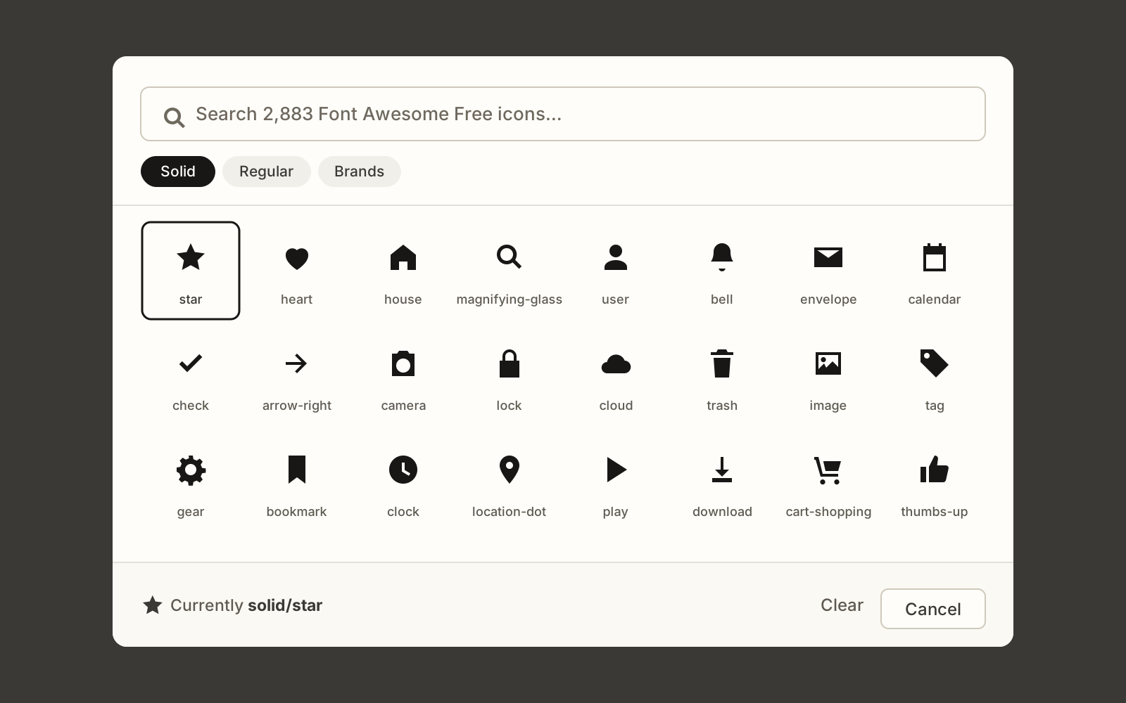
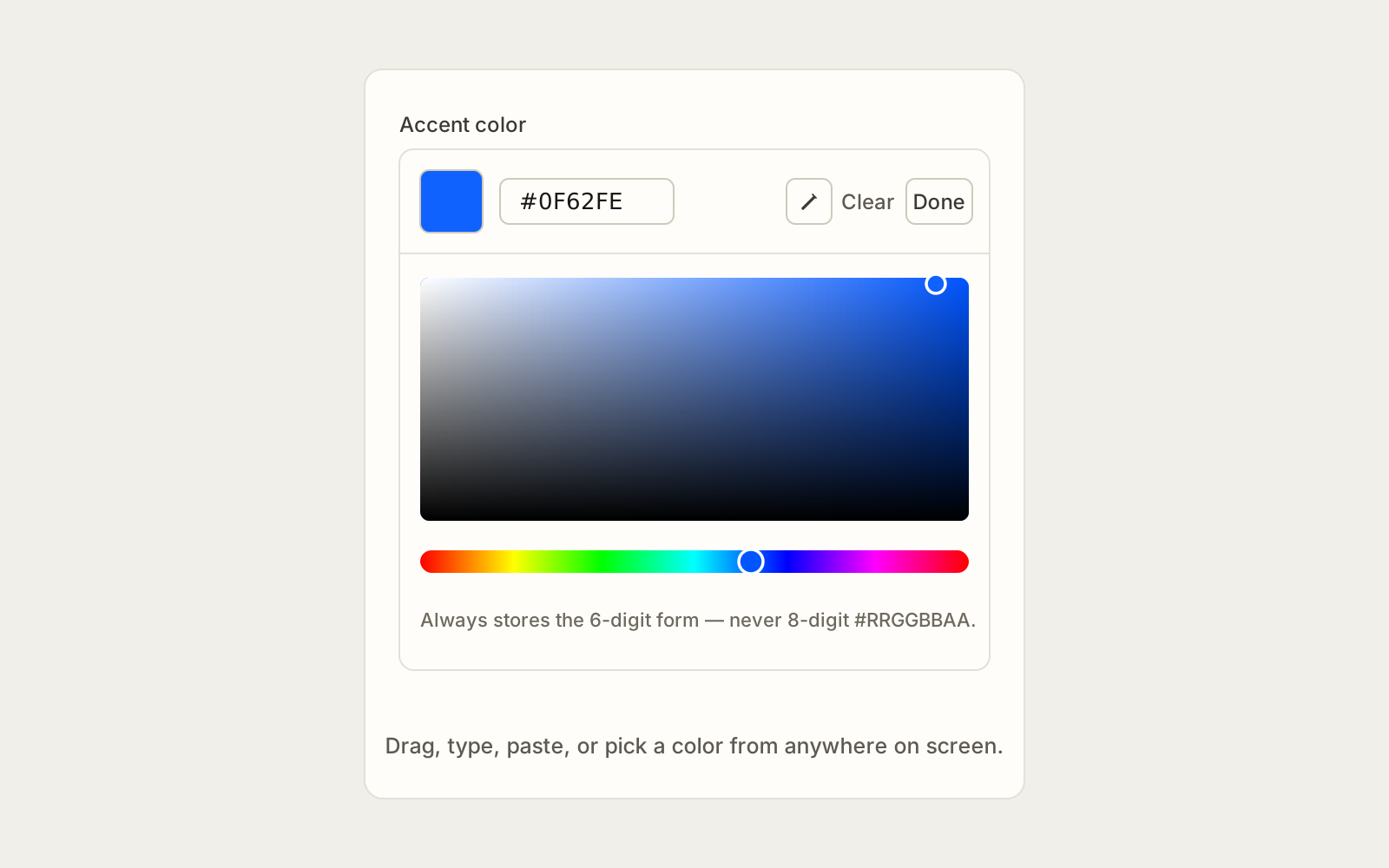
Color — Hex offers a saturation square, a hue slider, and a text box for typing or pasting a value. In Chromium browsers it also offers an eyedropper, for picking a color from anywhere on screen.
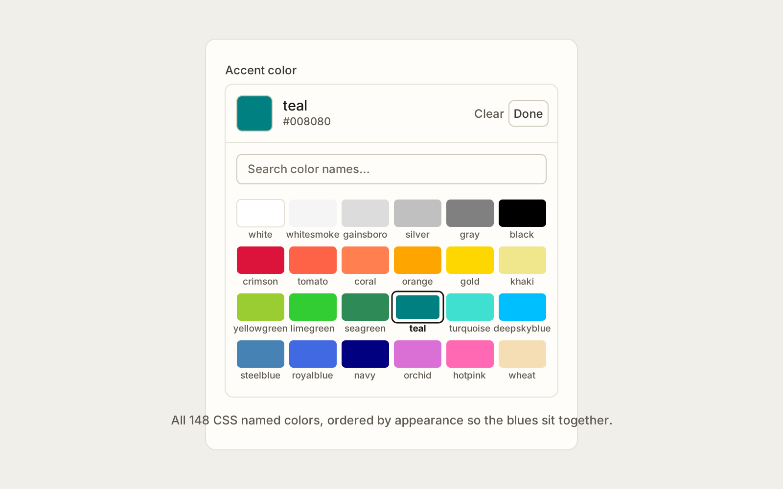
Color — Named lists the 148 CSS named colors, ordered by appearance rather than alphabetically, so the blues sit together and a color can be found by eye.
Outputting Content from Picker Fields on your Website
Every Picker Field stores a plain text string, never JSON. Your front end can use the value directly, and a field can be switched to or from an ordinary text field without migrating any content.
| Field | Example stored value |
|---|---|
| Icon — Lucide | arrow-right |
| Icon — Heroicons | outline/academic-cap |
| Icon — Font Awesome | solid/star, brands/github |
| Icon — Simple Icons (brands) | github |
| Color — Hex | #0F62FE |
| Color — Named | rebeccapurple |
Rendering Lucide icons in Next.js
An editor can pick any of Lucide's ~2,100 icons, so your site cannot keep a hand-written map of imported components — it has to resolve a name it has never seen before.
The obvious approach, importing the whole icon set so a name can be looked up, ships every icon to the browser. Use Lucide's own dynamicIconImports map instead: each entry is a static import the bundler can see, so you pay for one small server-side chunk per icon actually used, and nothing in the browser bundle.
// lib/icons/resolve.ts
import "server-only"
import dynamicIconImports from "lucide-react/dynamicIconImports"

export type IconNode = [tag: string, attrs: Record<string, string | number>][]
export interface ResolvedIcon {
  node: IconNode
  size: number
}

const cache = new Map<string, ResolvedIcon | null>()
type IconImports = Record<string, undefined | (() => Promise<unknown>)>

/** Turn a Lucide name stored by the CMS into the data needed to draw it. */
export const resolveIcon = async (name?: string | null): Promise<ResolvedIcon | null> => {
  const id = name?.trim().toLowerCase()
  if (!id) return null

  const cached = cache.get(id)
  if (cached !== undefined) return cached

  const load = (dynamicIconImports as unknown as IconImports)[id]
  if (!load) {
    cache.set(id, null)
    return null
  }

  try {
    const mod = (await load()) as {
      __iconData?: { node: IconNode; size?: number }
      __iconNode?: IconNode
    }

    // lucide-react 1.46 renamed __iconNode to __iconData. Read both: the older
    // shape fails silently, which is a miserable thing to debug after a bump.
    const icon = mod.__iconData?.node
      ? { node: mod.__iconData.node, size: mod.__iconData.size ?? 24 }
      : mod.__iconNode
        ? { node: mod.__iconNode, size: 24 }
        : null

    cache.set(id, icon)
    return icon
  } catch {
    cache.set(id, null)
    return null
  }
}
Returning null for an unknown name rather than throwing matters: a stale value left in the CMS should cost you one missing icon, not the whole page.
Then render the resolved data. Keeping this component free of any Lucide import means a client component can use it without pulling the icon set into the browser bundle:
// lib/icons/glyph.tsx
import { createElement } from "react"
import type { ResolvedIcon } from "./resolve"

export const Glyph = ({ icon, className }: { icon?: ResolvedIcon | null; className?: string }) => {
  if (!icon?.node.length) return null

  return (
    <svg
      xmlns="http://www.w3.org/2000/svg"
      width={icon.size}
      height={icon.size}
      viewBox={`0 0 ${icon.size} ${icon.size}`}
      fill="none"
      stroke="currentColor"
      strokeWidth={2}
      strokeLinecap="round"
      strokeLinejoin="round"
      className={className}
      aria-hidden="true"
    >
      {icon.node.map(([tag, attrs], index) => {
        // Lucide ships its own React key inside the attrs; pull it out so it is
        // passed as a key rather than spread onto the DOM element.
        const { key, ...rest } = attrs
        return createElement(tag, { key: key ?? index, ...rest })
      })}
    </svg>
  )
}
Use the two together from a server component:
import { resolveIcon } from "@/lib/icons/resolve"
import { Glyph } from "@/lib/icons/glyph"

export default async function FeatureCard({ fields }: { fields: { icon: string; title: string } }) {
  const icon = await resolveIcon(fields.icon)

  return (
    <div className="flex items-center gap-3">
      <Glyph icon={icon} className="size-6" />
      <h3>{fields.title}</h3>
    </div>
  )
}
Because the SVG uses stroke="currentColor", the icon takes its color from CSS. Pair an icon field with a Color — Hex field and your editors can set both.
Heroicons and Font Awesome
These two store the style and the name separated by a slash, because the same name exists in more than one style. Split the value on the slash and use the style to pick the right import path or CSS class:
const [style, name] = value.split("/")   // "solid/star"

// Font Awesome, via its CSS classes
const className = `fa-${style} fa-${name}`
Colors
Both color fields store a value that CSS accepts as-is, so it can go straight into a style attribute or a CSS custom property:
<div style={{ "--accent": fields.accentColor } as React.CSSProperties}>
  <button className="bg-[var(--accent)]">Get started</button>
</div>
Transparency
Color — Hex always stores the 6-digit #RRGGBB form. It never produces the 8-digit #RRGGBBAA form, because 8-digit hex is not safe everywhere a value might land — older Safari, email clients, and anything that parses the value itself rather than handing it to a browser.
Icon licensing
Icons are redistributed from their upstream packages, under their own licences: Lucide (ISC), Heroicons (MIT), Font Awesome Free (CC BY 4.0) and Simple Icons (CC0 1.0).
Simple Icons are brand logos. Using one is not a licence to use the brand it represents — check the brand's own guidelines before publishing.
Related
- App Types In Agility, on Marketplace versus Private Apps
- Apps, on installing and managing apps in an instance
- Power Fields, another app that adds field types to Agility
On this page