
Nobody remembers whether it is arrow-right or ArrowRight
Icons and colours are the last two fields that are still just a text box. The editor types a string from memory, and nobody finds out it was wrong until it renders. So we built pickers for both.

There is a particular kind of field that never quite gets solved. You add an icon to a content model, and because an icon is really just a name, the field is a text box. The editor types arrow-right. Or they type arrow_right, or ArrowRight, or arrowRight, and the page renders with a hole where the icon should be. Nobody finds out until somebody looks at the live site.
Colour is the same story. A hex field is a text box. Somebody pastes #0F62FE out of a brand doc, or they paste 0F62FE, or rgb(15, 98, 254), and it either works or it quietly does not.
We have been doing this to our own editors for years, on our own website, so this is not a hypothetical complaint about somebody else's CMS.
So we built Picker Fields, and it is in the Agility Marketplace now.
Six fields, and nothing to configure
Picker Fields adds six custom field types to your instance:
-
Icon — Lucide
-
Icon — Heroicons
-
Icon — Font Awesome
-
Icon — Simple Icons (brands)
-
Color — Hex
-
Color — Named
There are no settings and no API keys. Install it, and the six fields show up as field types on any content model. That was a deliberate decision. An earlier version had three config values for brand swatches and custom colour tokens, and every one of them was a thing an administrator had to get right before an editor could do anything. They are gone.
Browsing 3,400 icons without leaving the content form
The browsing UI deliberately opens in a modal rather than expanding inline. A custom field is a row in a form, a few dozen pixels tall, and Simple Icons alone runs to about 3,400 icons. Expanding that in place would either crush the grid or shove the rest of the content form off the screen every time somebody went looking for an arrow.
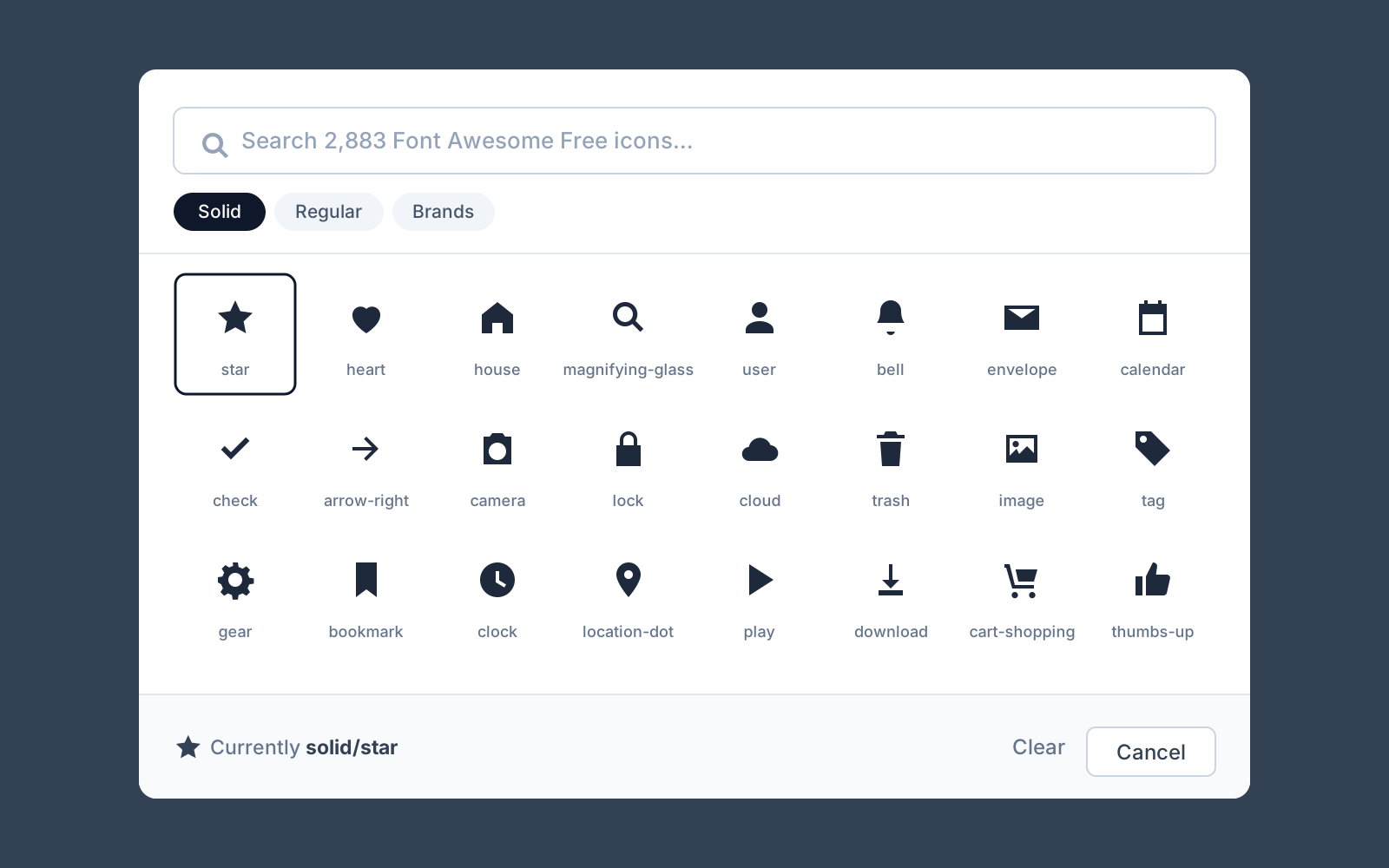
Search filters the whole catalogue as you type, with no debounce, because the catalogue for each library is a single small file of names and keywords that the picker fetches once and filters in memory. For the libraries that have styles, and Heroicons has four while Font Awesome has three, there is a filter for those too.
The icons themselves are separate files, lazy-loaded a few dozen at a time as you scroll. Inlining all 3,400 would cost megabytes up front to display the thirty actually on screen.
Colour, without pasting from a brand doc
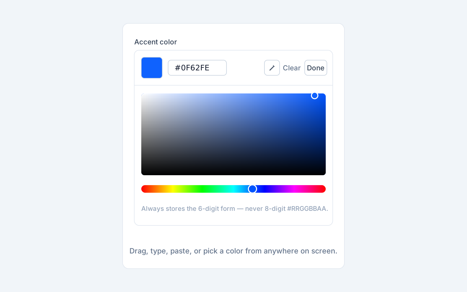
Color — Hex gives you a saturation square, a hue slider, and a text box that accepts whatever you paste at it. In Chromium browsers there is also an eyedropper, so you can pull a colour off anything on your screen.
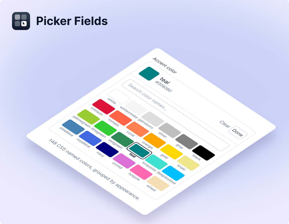
Color — Named lists the 148 CSS named colours. It orders them by appearance rather than alphabetically, which sounds fussy until you try to find a particular green in a list where forestgreen and seagreen are forty entries apart. Sorted by hue, the greys sit together at the front and the spectrum walks past after them.
One decision worth calling out: the hex field always stores the six-digit #RRGGBB form. It will never hand you #RRGGBBAA. Eight-digit hex is not safe everywhere a value might land, including older Safari, email clients, and anything that parses the string itself rather than handing it to a browser. If you need transparency, you want a separate opacity field, not a colour value that sometimes has two extra characters on the end.
The values are plain strings, and that is the whole point
Every one of these fields stores a plain text string. Not JSON.
-
Icon — Lucide stores
arrow-right -
Icon — Heroicons stores
outline/academic-cap -
Icon — Font Awesome stores
solid/star -
Icon — Simple Icons stores
github -
Color — Hex stores
#0F62FE -
Color — Named stores
rebeccapurple
This matters more than it sounds. A field that stores a JSON blob is a field you can never change your mind about. A field that stores arrow-right is a text field with a nicer editor bolted on, and you can switch it to or from an ordinary text field without migrating a single content item. If you already have an icon field full of hand-typed Lucide names, you can change its type and keep every value you have.
It also means your front end does not have to learn anything new. The value is the value.
Rendering them without shipping 2,000 icons to the browser
This is the part that bit us on our own site, so it is worth the warning.
An editor can pick any of Lucide's ~2,100 icons, which means your front end cannot keep a hand-written map of imported components. It has to resolve a name it has never seen before. The obvious way to do that is to import the whole icon set and index into it:
// Don't do this
import { icons } from "lucide-react"
const Cmp = icons[toPascalCase(name)]
That works, and it ships every icon in the library to the browser so you can draw one of them. Our header was once sending 48 icon components down the wire to render a handful.
Use Lucide's own dynamicIconImports map instead. Each entry is a static import the bundler can see, so you get one small server-side chunk per icon actually used, and nothing extra in the browser bundle:
import dynamicIconImports from "lucide-react/dynamicIconImports"

const load = dynamicIconImports[name]
if (!load) return null          // unknown name costs one icon, not the page

const mod = await load()
const icon = mod.__iconData ?? { node: mod.__iconNode, size: 24 }
Resolve the icon on the server, pass it across as data, and render it with a small component that has no Lucide import at all. The full version, including a Glyph component you can copy, is in the Picker Fields documentation.
One last thing that falls out of this for free: because the rendered SVG uses stroke="currentColor", the icon takes its colour from CSS. Put an icon field and a Color — Hex field side by side on the same model and your editors can set both.
Install it
Go to Settings > Apps in your instance, click Install, and search for Picker Fields. There is no configuration step, so you are done as soon as it finishes.
The full documentation covers every field, the exact stored values, and the front-end rendering code for all four icon libraries.
A note on the brand icons: Simple Icons are published under CC0, but they are still brand logos. Using one is not a licence to use the brand it represents, so check the brand's own guidelines before you put somebody's mark on your homepage.

About the Author
Joel is CTO at Agility. His first job, though, is as a father to 2 amazing humans.
Joining Agility in 2005, he has over 20 years of experience in software development and product management. He embraced cloud technology as a groundbreaking concept over a decade ago, and he continues to help customers adopt new technology with hybrid frameworks and the Jamstack. He holds a degree from The University of Guelph in English and Computer Science. He's led Agility CMS to many awards and accolades during his tenure such as being named the Best Cloud CMS by CMS Critic, as a leader on G2.com for Headless CMS, and a leader in Customer Experience on Gartner Peer Insights.
As CTO, Joel oversees the Product team, as well as working closely with the Growth and Customer Success teams. When he's not kicking butt with Agility, Joel coaches high-school football and directs musical theatre.