Form Submissions
Forms are crucial for almost any website or web application. In Agility, we can leverage Content Models to define Forms and Form Inputs, and use Page Modules to render the Forms onto our front-end solution.
In this article, I'll walk you through the steps needed to create a custom Form Builder in Agility for your Jamstack website(s).
Getting Started
To get started, make sure you've signed up for a Free Agility CMS Account. In this article, I'll be using the Next.js Blog Template Starter for the front-end solution, however, this solution can theoretically be applied to any Starter/Framework you select.
Creating a Form Input Content Model
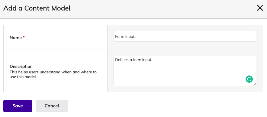
To start, we'll need to create a Content Model to define our form inputs and initialize it as a Content List. In Agility, head to Models > Content Models, and create a new Content Model called Form Inputs.
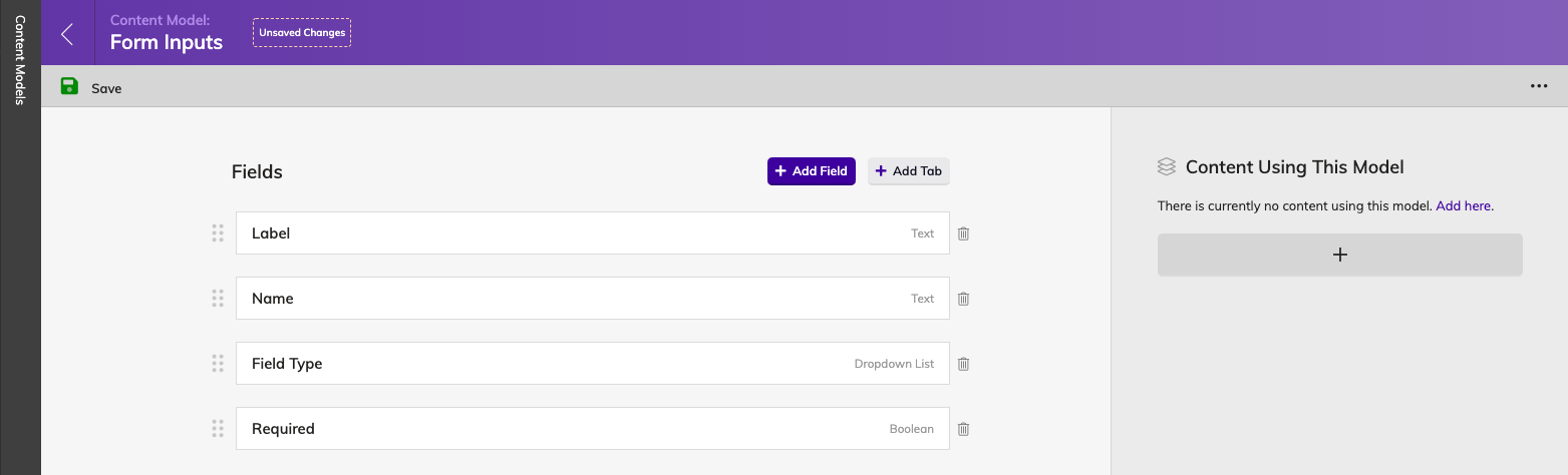
Add the following fields to the Content Model:
- Label: Text Field
- Name: Text Field
- Field Type: Dropdown List
- Text - text
- Telephone - tel
- Email - email
- Textarea - textarea
- Required - Boolean
Once your Form Inputs Content Model looks like the example below, go ahead and create a new Content List using this Content Model:
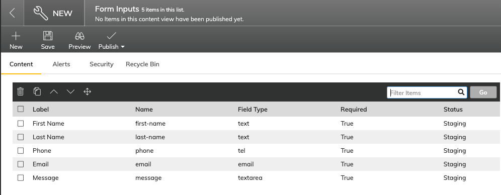
When the Form Inputs list is initialized, you can then add new Form Input items to the list:
Creating a Form Content Model
Let's head back into the Models > Content Models area, and create a new Content Model to define what a Form should look like:
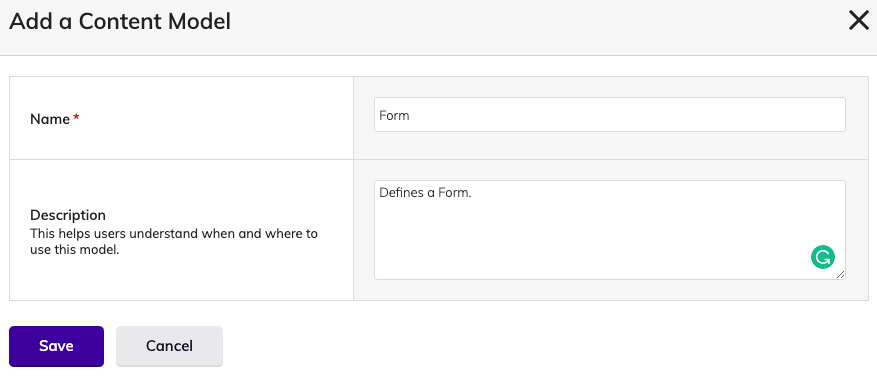
- Name: Text Field
- Form Inputs: Linked Content
- Link To: Content
- Link Type: Specific Item(s) From a List
- Render UI: Search List Box (Select Many)
- Content Selection: Specific Content List
- Content Reference: Form Inputs (List)
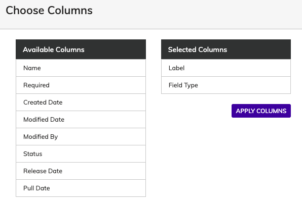
For the Form Inputs Linked Content Field, scroll down and expand the Advanced Settings, then edit the visible columns. Make sure the Label and Field Type are selected as Visible Columns, this will make it easier for editors to understand which field their adding to build out their form(s).
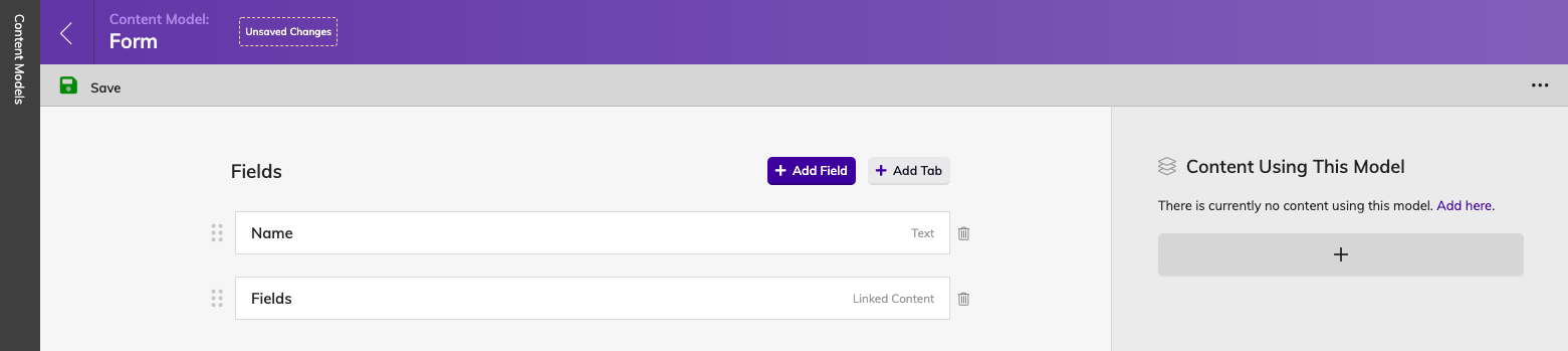
Once your Form Content Model looks like the example below, go ahead and create a new Content List using this Content Model:
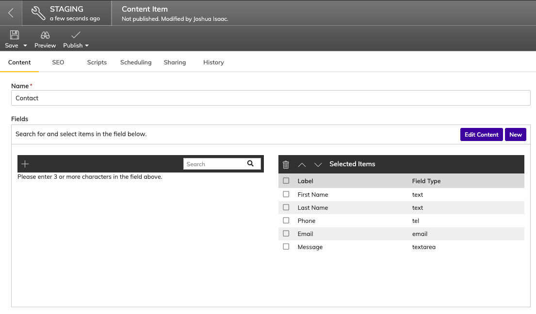
When the Form Inputs list is initialized, you can then add a new Form item to the list, I'll just create a Contact Form for now:
Creating a Form Page Module
The next step is to create a Page Module where Editors can select which Form they would like to output on the page.
Back in the Models area, click on Page Modules and create a new Page Module called Form:
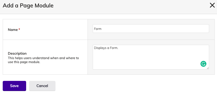
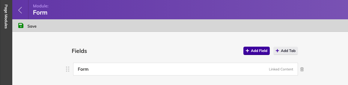
Add the following field to the Form Page Module:
- Form: Linked Content
- Link To: Content
- Link Type: Specific Item(s) From a List
- Render UI: Dropdown List(Select One)
- Content Selection: Specific Content List
- Content Reference: Forms (List)
Adding a Form To a Page
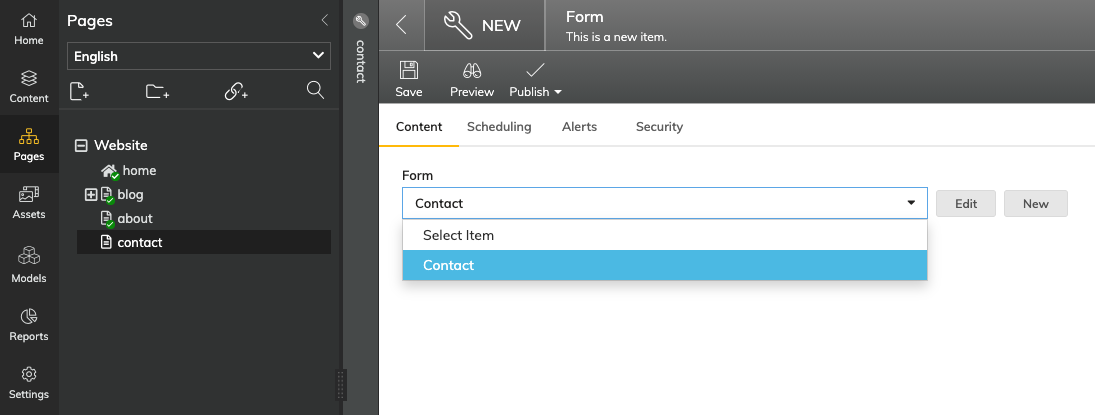
In the Content Manager, head to Pages and create a new Page called Contact. From there, add the Form Page Module to the Main Content Zone, and select the Contact Form from the Dropdown Select:
Rendering a Form on the Frontend
Since we're using Next.js for this tutorial, we'll need to create a new React component for our Form Page Module.
Setting up your Next.js Development Environment
Create a new file named Form.js in the ./components/agility-pageModules directory, make sure to add the new component in the allModules array within the index.js file in the same directory.
Copy and paste the following code snippet into the Form.js Page Module component:
import React from "react";

const Form = ({ module }) => {
  // get all fields for form
  const formFields = module.fields.form.fields.fields;
  return (
    <section className="max-w-lg mx-auto mt-12">
      <h1 className="text-4xl mb-8 text-center">
        {module.fields.form.fields.name}
      </h1>
      <form>
        {formFields.map((field, index) => {
          // switch/case statement to determine how to render for each field type
          switch (field.fields.fieldType) {
            case "text":
              return (
                <label htmlFor={field.fields.name} key={index}>
                  <span className="block">{field.fields.label}</span>
                  <input
                    type={field.fields.fieldType}
                    name={field.fields.name}
                    placeholder={field.fields.label}
                    required={field.fields.required === "true" ? true : null}
                    className="border-2 border-black w-full mb-4 p-2"
                  />
                </label>
              );
            case "tel":
              return (
                <label htmlFor={field.fields.name} key={index}>
                  <span className="block">{field.fields.label}</span>
                  <input
                    type={field.fields.fieldType}
                    name={field.fields.name}
                    placeholder={field.fields.label}
                    required={field.fields.required === "true" ? true : null}
                    className="border-2 border-black w-full mb-4 p-2"
                  />
                </label>
              );
            case "email":
              return (
                <label htmlFor={field.fields.name} key={index}>
                  <span className="block">{field.fields.label}
                  <input
                    type={field.fields.fieldType}
                    name={field.fields.name}
                    placeholder={field.fields.label}
                    required={field.fields.required === "true" ? true : null}
                    className="border-2 border-black w-full mb-4 p-2"
                  />
                </label>
              );
            case "textarea":
              return (
                <label htmlFor={field.fields.name} key={index}>
                  <span className="block">{field.fields.label}</span>
                  <textarea
                    type={field.fields.fieldType}
                    name={field.fields.name}
                    placeholder={field.fields.label}
                    required={field.fields.required === "true" ? true : null}
                    rows="4"
                    className="border-2 border-black w-full mb-4 p-2"
                  />
                </label>
              );
          }
        })}
        <button type="submit" className="bg-black text-white py-2 px-4 w-full">
          Submit
        </button
      </form>
    </section>
  );
};

export default Form;
This component is made up of a simple switch/case statement to determine how to render each field type.
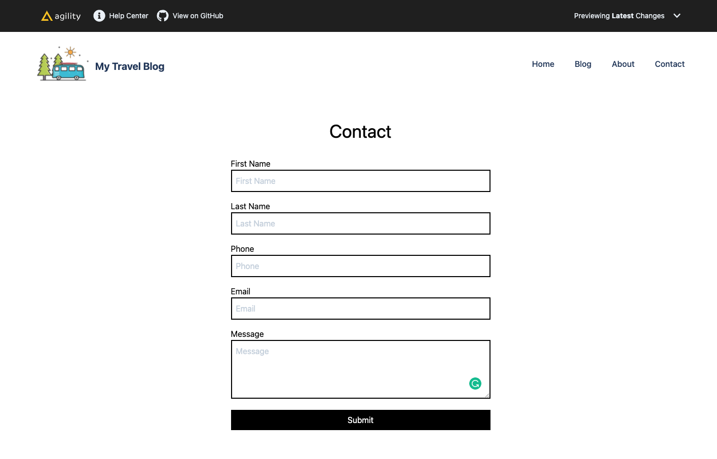
The expected output should look like the following: