How to Create Agile Landing Pages for Better Conversions

Start building landing pages that convert!

Gaurav Sharma
Gaurav Sharma
Jan 12, 2022
How to Create Agile Landing Pages for Better Conversions

No doubt, a well-designed website is the first step to building an online business.

However, to generate leads and make sales, you need to create agile landing pages.

A landing page is a standalone web page. 

It’s the point visitors land once they click on a link on your marketing campaigns, such as a link on an email newsletter or any other digital ad.

For the landing page to be effective, it needs to be value-packed and provide your visitors with a smooth user experience.

Everything from the layout to the copy and call-to-action (CTA) used should be flawless and compelling.  

With this in mind, there are many landing page builders that can help you create converting landing pages in no time. Here are the best practices to create agile landing pages.

Creating agile landing pages on agilitycms.com

Create Agile Landing Pages with a Clean Layout and Structure

The first step to creating agile landing pages is a layout that drives your visitors to convert.

It should have a clean and attractive design while also being informative.

All the elements on the landing page should be functional and effective towards achieving this goal. This includes:

  • A headline, and where possible, a subheading
  • A short description of what you’re offering
  • A compelling copy that entices your visitors to convert. You can have the key points in the text and have at least one relevant image or a short video that explains the details
  • A lead form  
  • A CTA button directs visitors to the next step.

Arrange these elements in a direction-oriented layout. A visitor should naturally navigate the page with minimal distractions.

This means skipping the usual website navigation, pop-ups, or other internal links redirecting them to another page.   

Can you add more elements to the landing page?

Sure.

Add social share buttons if you need to. 

And depending on the stage your target audience is on their buyer’s journey, add any other information you deem necessary to encourage them to convert.

Desk with multiple devices

Add Visual Appeal with Colors 

This may come as a surprise but the color is important if you want to create agile landing pages.

The colors on your landing page should match your brand’s colors.

It’ll make it easier for visitors to associate the colors with your company, which cements your brand’s identity and establishes trust.  

The CTA button needs to stand out. You can achieve this by using a color that strongly contrasts with the background color.

Check What’s Above the Fold

It is an amateur mistake to place crucial information way below the fold so the reader has to scroll down to find it. It’s not going to happen!

Instead, Keep in mind that the key information should appear above the fold and within a person’s direct line of viewing.

The “fold” marks the end of the part of the landing page that’s visible on the browser window once it loads. 

It’s the point at which a visitor would have to scroll to see more information.   

If the information above the fold is irrelevant to the visitor, they’ll bounce.

Here’s some inspiration on how to create agile landing pages by maximizing the potential of the space above the fold:

  • Put a CTA button or lead form. It’ll make it easier for visitors who are already willing to convert to do so without having to scroll down.
  • Present your value proposition. Answer the visitor’s question: “What’s in it for me?”
  • Add a featured image, GIF, or video 

Agility CMS video on their home page

This is a perfect example of a landing page aimed at collecting email addresses for email marketing campaigns.

Here is why we love this landing page:

  • The CTA is near the top of the page, above the fold.  It’s green too, which makes it stand out.
  • There’s a featured image of a smiling Noah Kagan with the caption ‘Noah Kagan, doing his “I Know Shit” look.’  It gives the visitor confidence that they’ll get advice from the best minds.
  • It gives visitors a free PDF on the “10 Commandments of Entrepreneurship”.

Other details can appear below the fold with CTA buttons and lead forms appearing at regular intervals. 

You could also design them to move along with the user as they scroll down the page.

It’ll ensure that anytime a visitor decides to convert, they’ll have to do a little scrolling to find the CTA button or form.

Create Agile Landing Pages that are Scannable

You want to make sure that a visitor can take in the most vital information on your landing page in less than five seconds.

A great way to achieve this is by guiding the visitor using an F-pattern.

An F-pattern is a layout based on the way most people read, which is left to right.

By frontloading the most important information left to right, you place this info in their direct line of viewing.

As a visitor scans the page, the layout will guide your visitor’s eye to important details that’ll entice them to convert.

As you create agile landing pages, ensure that they’re mobile responsive.

Data shows that half of all web traffic is from mobile devices. This means having a mobile-friendly landing page increases your visitors and conversions.

9 Tips to Create Agile Landing Pages that Convert

Now that you have the right layout, here are a few measures you can take to create agile landing pages. 

1. Create Agile Landing Pages with a Killer Headline

The headline is your first chance to impress the visitor. It’ll also reassure them that they’re on the right page. 

A good headline will communicate the value of your offer briefly and clearly, in about 10 words.

It will make the visitor curious to know more about what you’re offering.

There’re a few ways to create agile landing pages with great headlines:

Idea 1: Pinpoint the benefit your product or service offers to the visitor.

Agility CMS landing page

Idea 2: Get to the point—fast.

Take the next steps with Agility CMS

Idea 3: State your unique selling point.

Agility CMS' unique selling point

Idea 4: Address a pain point.

Development, enterprise style with Agility CMS

2. Your CTA Should Be Clear

A powerful CTA is one of the ways to create agile landing pages.

Compel the visitor to click the CTA button with these tips:

  • Be clear on what you want the visitor to do using a few words, such as, “Enter your email to get lifetime access.”
  • On the CTA button, use an action verb like “Download” “Get it now” or “Register”.
  • The CTA button should be large enough to stand out from the rest of the text.
  • Don’t crowd your CTA. Have some negative space around it.

Here is an example from Netflix.

The CTA is short and the CTA button is big and clear on the action the visitor should take. 

Netflix CTA example

Image Source: Netflix

3. Have a Concise and Compelling Copy

You probably have a lot of words to convince your visitor about your product or service. But to create agile landing pages less wins.  

Have a simple plain message that’s above the fold to explain how your business can benefit the visitor. 

Use persuasive language to direct them to take the action you want them to complete.

If the visitor wishes to have more information, you can elaborate below the fold or add a “Learn More” link like Apple has done.

Apple CTA example for agile landing pages

Image Source: Apple

Create agile landing pages by engaging the visitor using words like “you” and “your”.

When editing the landing page, check that every sentence supports your call to action. If it doesn’t serve this purpose, remove it. 

Too many details can overwhelm the visitor and cause them to leave.

Keep the visitor’s attention and make the copy easier to digest by adding a lot of white space. Use bullet points to explain any details.

Here is an example from Prezi. This is the copy above the fold.

Agile landing page on agilitycms.com

Image Source: Prezi

It’s a total of 30 words, including the title.

Notice how they use “you” and “your” to engage the visitor? The copy explains what Prezi has to offer and a CTA falls right below this persuading text.

The video above the fold is also short, only two minutes and 14 seconds.

Below the fold, the text and videos get a little longer.

Agile landing page text below fold on agilitycms.com

Image Source: Prezi

4. Use Trust Signals to Create Agile Landing Pages

Create agile landing pages by including lots of trust signals.

Trust signals are evidence that makes a visitor feel more secure in their decision to convert.

They can take the form of:

  • Testimonials: Endorsements from past clients show visitors that your business is trustworthy.
  • Trust badges: These are logos of trusted brands that you have worked with. It can also include recognitions and endorsements you’ve received or organizations you’re a part of.
  • Case studies: They combine success stories from previous customers with hard facts and data to create compelling social proof. 

Using a website management workflow will enable your team to communicate internally on the development of different elements of your landing page to ensure it ticks all the boxes. 

You can use more than one trust signal to create agile landing pages as Teamwork has done. They use testimonials and trust badges on their page.

A page example of agility

Image Source: Teamwork

Show your visitors that others have used your product and service and benefited.

5. Create Agile Landing Pages with Short Forms

Again, less is more when you want to create agile landing pages with a lead form. 

Use a form builder to create lead forms that require visitors to fill in as few fields as possible—only the essentials.

For instance, most people don’t mind giving their name and email address for a newsletter. But if you go on to ask for their phone number, they’ll abandon the form.

If they’re making a purchase, billing info and shipping details are enough.

If you need more details to provide a specialized solution, make it easy on the visitor by using a drop-down menu where they can select options instead of typing.

6. Add the Right Keywords

Sure, your email marketing software is driving a crazy number of visitors to your landing page.

But you need to create agile landing pages that are optimized with target keywords for search engines—both organic search and paid campaigns.

This means when someone searches for your keyword, it’ll be possible to find your landing page  on the search engine results.

Use an SEO tool like SEMRush to find the right keywords to target.

7. Use Relevant Visuals

Create agile landing pages by complementing your offer in visual form.    

Use relevant images to grab attention. They should represent your target audience and your product.

8. Create Agile Landing Pages that Match Your Campaigns

Which channels will you use on your marketing campaigns to get your product in front of your audience? Facebook ads, email marketing, or lead generation tool?

Note that visitors from each channel will be different. Create agile landing pages by having a different page suited for the audience of each channel.

Elements of design used in the campaigns, such as font, images, colors, should also be similar to the elements on the landing page. It creates consistency.  

9. Enhance Customer Service with a Chatbot

If you want to create agile landing pages, you can’t overlook customer service.

Your copy cannot answer every question your visitors will have. For this reason, incorporate a chatbot on the landing page. However, that's not where it all ends. Adding a chatbot to your landing page is only half the battle. It's also important to choose the right chatbot to integrate with your landing page. An intelligent chatbot can change things up for your brand. Powered by AI, these chatbots can understand users' queries and answer them accordingly, unlike simple chatbots.

Take this example of Hubspot academy’s landing page

Hubspot academy's landing page

Image Source: HubSpot Academy

There is a chatbot on the right that remains in place even as the visitor scrolls down the page.

Ready to Create Agile Landing Pages that Boost Conversions?

This is only a guide to help you create agile landing pages. There are no hard rules.

Try out different colors and positions for your CTA button. Experiment with different visuals, form designs, keywords, and headlines. And test the performance of each design.

Once you find the landing page that brings the best response from your target audience, keep refining it.  

Back to All Articles
Jan 12, 2022

How to Create Agile Landing Pages for Better Conversions

Start building landing pages that convert!
Gaurav Sharma
How to Create Agile Landing Pages for Better Conversions

No doubt, a well-designed website is the first step to building an online business.

However, to generate leads and make sales, you need to create agile landing pages.

A landing page is a standalone web page. 

It’s the point visitors land once they click on a link on your marketing campaigns, such as a link on an email newsletter or any other digital ad.

For the landing page to be effective, it needs to be value-packed and provide your visitors with a smooth user experience.

Everything from the layout to the copy and call-to-action (CTA) used should be flawless and compelling.  

With this in mind, there are many landing page builders that can help you create converting landing pages in no time. Here are the best practices to create agile landing pages.

Creating agile landing pages on agilitycms.com

Create Agile Landing Pages with a Clean Layout and Structure

The first step to creating agile landing pages is a layout that drives your visitors to convert.

It should have a clean and attractive design while also being informative.

All the elements on the landing page should be functional and effective towards achieving this goal. This includes:

  • A headline, and where possible, a subheading
  • A short description of what you’re offering
  • A compelling copy that entices your visitors to convert. You can have the key points in the text and have at least one relevant image or a short video that explains the details
  • A lead form  
  • A CTA button directs visitors to the next step.

Arrange these elements in a direction-oriented layout. A visitor should naturally navigate the page with minimal distractions.

This means skipping the usual website navigation, pop-ups, or other internal links redirecting them to another page.   

Can you add more elements to the landing page?

Sure.

Add social share buttons if you need to. 

And depending on the stage your target audience is on their buyer’s journey, add any other information you deem necessary to encourage them to convert.

Desk with multiple devices

Add Visual Appeal with Colors 

This may come as a surprise but the color is important if you want to create agile landing pages.

The colors on your landing page should match your brand’s colors.

It’ll make it easier for visitors to associate the colors with your company, which cements your brand’s identity and establishes trust.  

The CTA button needs to stand out. You can achieve this by using a color that strongly contrasts with the background color.

Check What’s Above the Fold

It is an amateur mistake to place crucial information way below the fold so the reader has to scroll down to find it. It’s not going to happen!

Instead, Keep in mind that the key information should appear above the fold and within a person’s direct line of viewing.

The “fold” marks the end of the part of the landing page that’s visible on the browser window once it loads. 

It’s the point at which a visitor would have to scroll to see more information.   

If the information above the fold is irrelevant to the visitor, they’ll bounce.

Here’s some inspiration on how to create agile landing pages by maximizing the potential of the space above the fold:

  • Put a CTA button or lead form. It’ll make it easier for visitors who are already willing to convert to do so without having to scroll down.
  • Present your value proposition. Answer the visitor’s question: “What’s in it for me?”
  • Add a featured image, GIF, or video 

Agility CMS video on their home page

This is a perfect example of a landing page aimed at collecting email addresses for email marketing campaigns.

Here is why we love this landing page:

  • The CTA is near the top of the page, above the fold.  It’s green too, which makes it stand out.
  • There’s a featured image of a smiling Noah Kagan with the caption ‘Noah Kagan, doing his “I Know Shit” look.’  It gives the visitor confidence that they’ll get advice from the best minds.
  • It gives visitors a free PDF on the “10 Commandments of Entrepreneurship”.

Other details can appear below the fold with CTA buttons and lead forms appearing at regular intervals. 

You could also design them to move along with the user as they scroll down the page.

It’ll ensure that anytime a visitor decides to convert, they’ll have to do a little scrolling to find the CTA button or form.

Create Agile Landing Pages that are Scannable

You want to make sure that a visitor can take in the most vital information on your landing page in less than five seconds.

A great way to achieve this is by guiding the visitor using an F-pattern.

An F-pattern is a layout based on the way most people read, which is left to right.

By frontloading the most important information left to right, you place this info in their direct line of viewing.

As a visitor scans the page, the layout will guide your visitor’s eye to important details that’ll entice them to convert.

As you create agile landing pages, ensure that they’re mobile responsive.

Data shows that half of all web traffic is from mobile devices. This means having a mobile-friendly landing page increases your visitors and conversions.

9 Tips to Create Agile Landing Pages that Convert

Now that you have the right layout, here are a few measures you can take to create agile landing pages. 

1. Create Agile Landing Pages with a Killer Headline

The headline is your first chance to impress the visitor. It’ll also reassure them that they’re on the right page. 

A good headline will communicate the value of your offer briefly and clearly, in about 10 words.

It will make the visitor curious to know more about what you’re offering.

There’re a few ways to create agile landing pages with great headlines:

Idea 1: Pinpoint the benefit your product or service offers to the visitor.

Agility CMS landing page

Idea 2: Get to the point—fast.

Take the next steps with Agility CMS

Idea 3: State your unique selling point.

Agility CMS' unique selling point

Idea 4: Address a pain point.

Development, enterprise style with Agility CMS

2. Your CTA Should Be Clear

A powerful CTA is one of the ways to create agile landing pages.

Compel the visitor to click the CTA button with these tips:

  • Be clear on what you want the visitor to do using a few words, such as, “Enter your email to get lifetime access.”
  • On the CTA button, use an action verb like “Download” “Get it now” or “Register”.
  • The CTA button should be large enough to stand out from the rest of the text.
  • Don’t crowd your CTA. Have some negative space around it.

Here is an example from Netflix.

The CTA is short and the CTA button is big and clear on the action the visitor should take. 
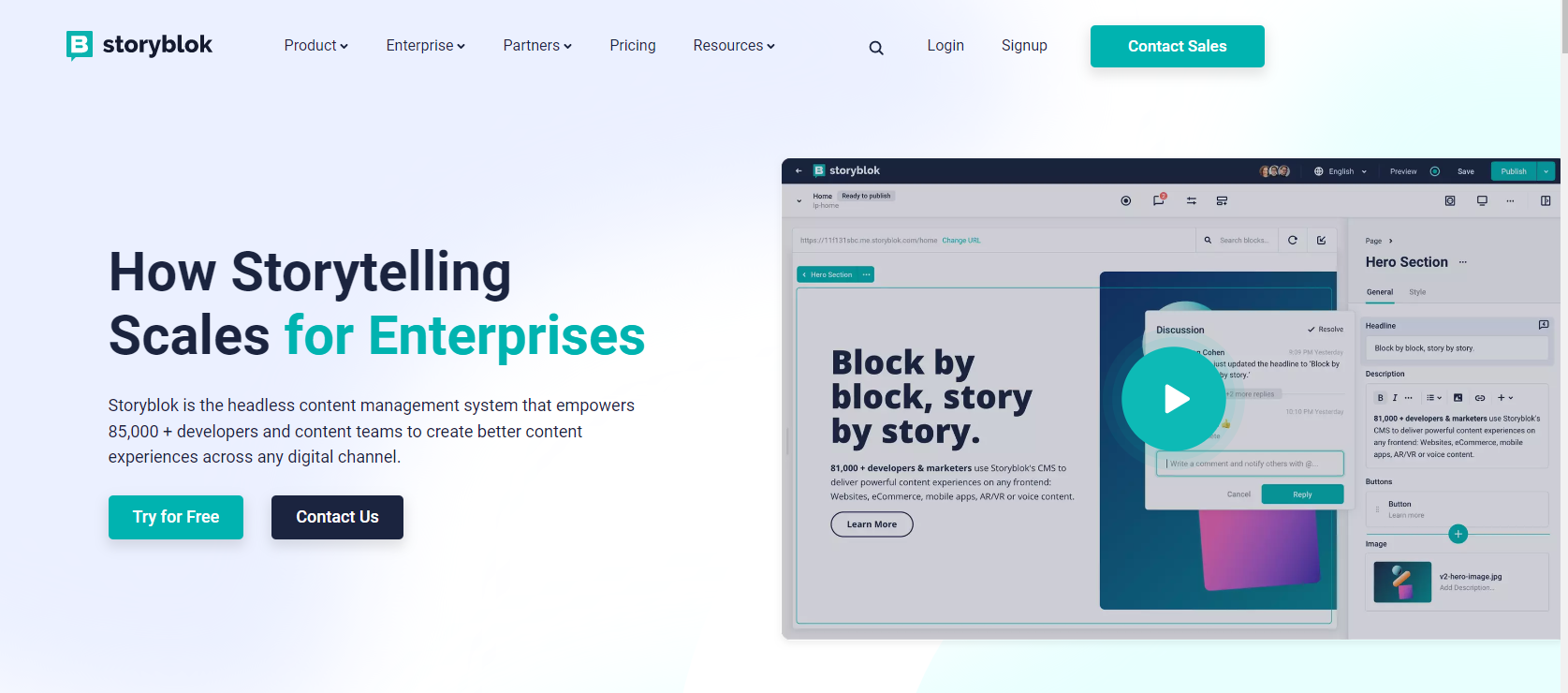
Netflix CTA example

Image Source: Netflix

3. Have a Concise and Compelling Copy

You probably have a lot of words to convince your visitor about your product or service. But to create agile landing pages less wins.  

Have a simple plain message that’s above the fold to explain how your business can benefit the visitor. 

Use persuasive language to direct them to take the action you want them to complete.

If the visitor wishes to have more information, you can elaborate below the fold or add a “Learn More” link like Apple has done.
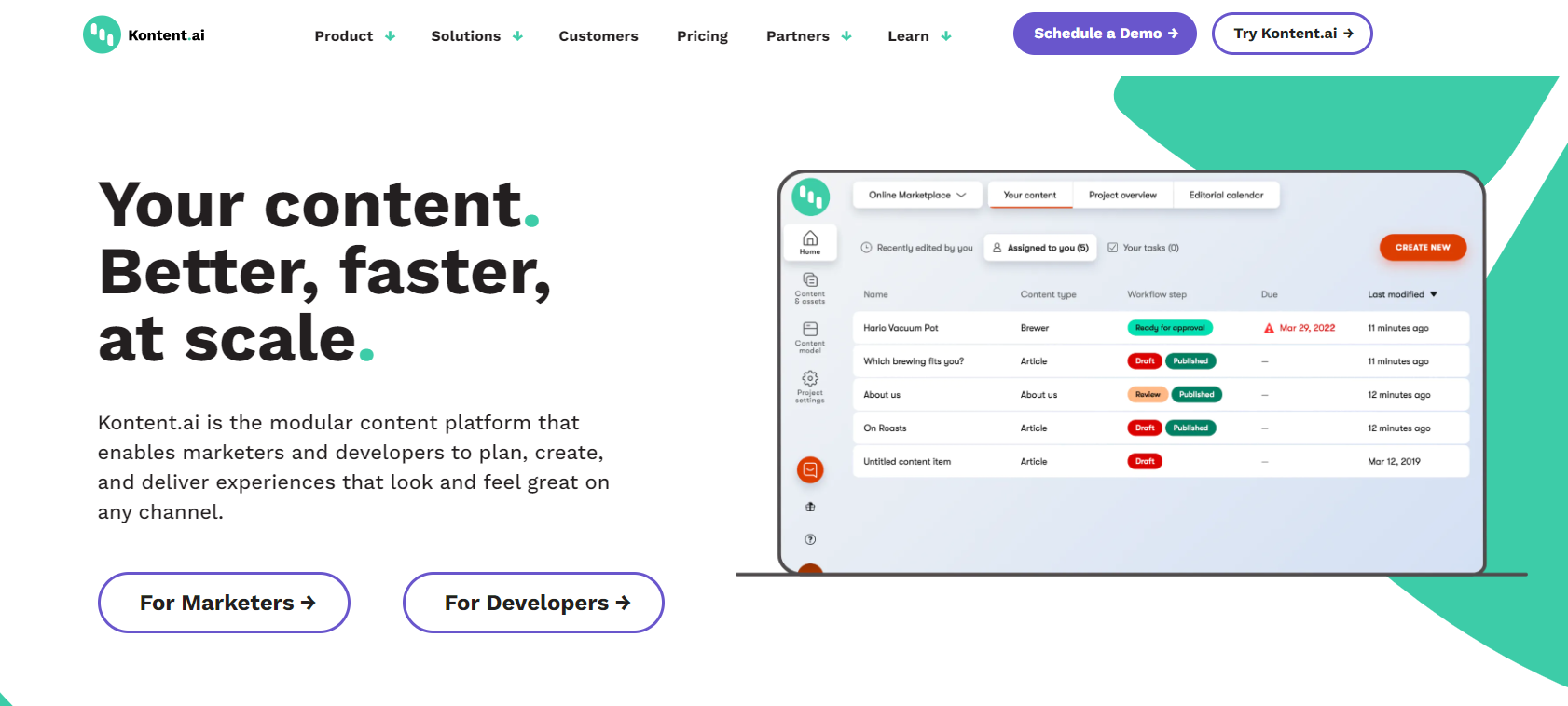
Apple CTA example for agile landing pages

Image Source: Apple

Create agile landing pages by engaging the visitor using words like “you” and “your”.

When editing the landing page, check that every sentence supports your call to action. If it doesn’t serve this purpose, remove it. 

Too many details can overwhelm the visitor and cause them to leave.

Keep the visitor’s attention and make the copy easier to digest by adding a lot of white space. Use bullet points to explain any details.

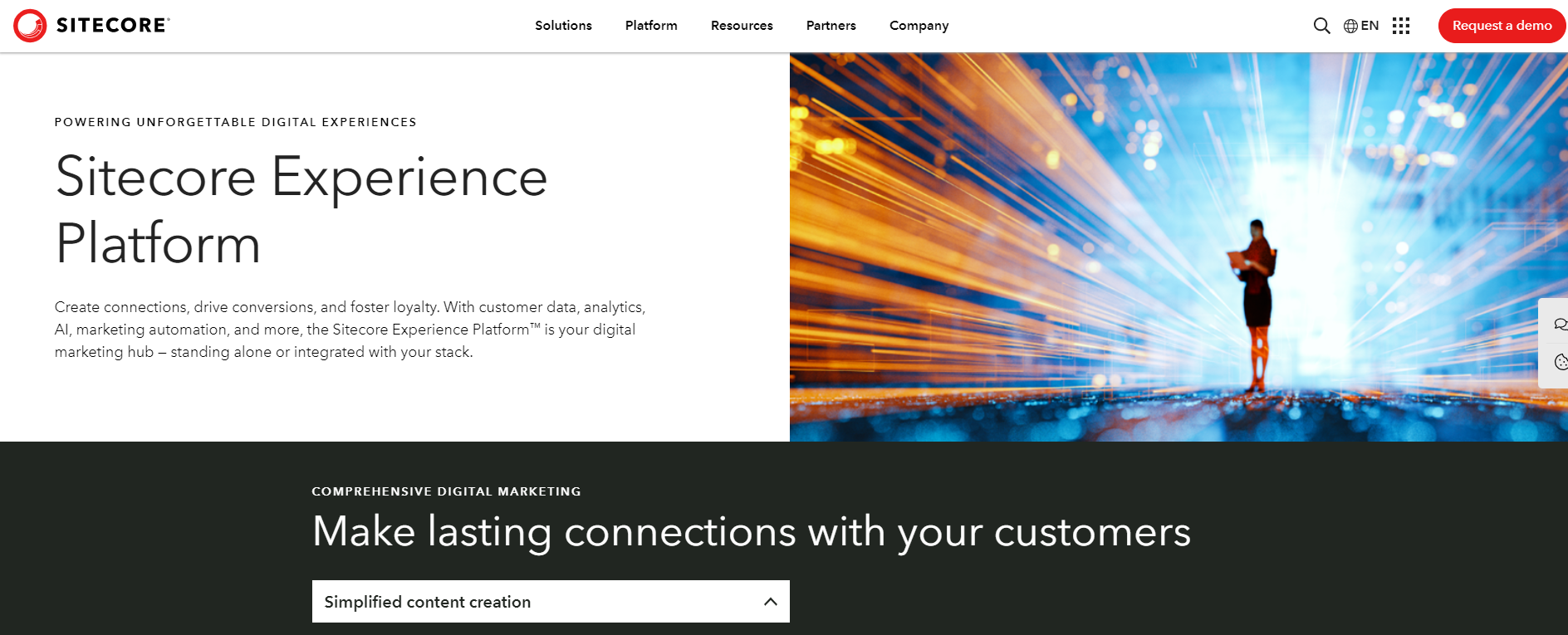
Here is an example from Prezi. This is the copy above the fold.
Agile landing page on agilitycms.com

Image Source: Prezi

It’s a total of 30 words, including the title.

Notice how they use “you” and “your” to engage the visitor? The copy explains what Prezi has to offer and a CTA falls right below this persuading text.

The video above the fold is also short, only two minutes and 14 seconds.

Below the fold, the text and videos get a little longer.
Agile landing page text below fold on agilitycms.com

Image Source: Prezi

4. Use Trust Signals to Create Agile Landing Pages

Create agile landing pages by including lots of trust signals.

Trust signals are evidence that makes a visitor feel more secure in their decision to convert.

They can take the form of:

  • Testimonials: Endorsements from past clients show visitors that your business is trustworthy.
  • Trust badges: These are logos of trusted brands that you have worked with. It can also include recognitions and endorsements you’ve received or organizations you’re a part of.
  • Case studies: They combine success stories from previous customers with hard facts and data to create compelling social proof. 

Using a website management workflow will enable your team to communicate internally on the development of different elements of your landing page to ensure it ticks all the boxes. 

You can use more than one trust signal to create agile landing pages as Teamwork has done. They use testimonials and trust badges on their page.
A page example of agility

Image Source: Teamwork

Show your visitors that others have used your product and service and benefited.

5. Create Agile Landing Pages with Short Forms

Again, less is more when you want to create agile landing pages with a lead form. 

Use a form builder to create lead forms that require visitors to fill in as few fields as possible—only the essentials.

For instance, most people don’t mind giving their name and email address for a newsletter. But if you go on to ask for their phone number, they’ll abandon the form.

If they’re making a purchase, billing info and shipping details are enough.

If you need more details to provide a specialized solution, make it easy on the visitor by using a drop-down menu where they can select options instead of typing.

6. Add the Right Keywords

Sure, your email marketing software is driving a crazy number of visitors to your landing page.

But you need to create agile landing pages that are optimized with target keywords for search engines—both organic search and paid campaigns.

This means when someone searches for your keyword, it’ll be possible to find your landing page  on the search engine results.

Use an SEO tool like SEMRush to find the right keywords to target.

7. Use Relevant Visuals

Create agile landing pages by complementing your offer in visual form.    

Use relevant images to grab attention. They should represent your target audience and your product.

8. Create Agile Landing Pages that Match Your Campaigns

Which channels will you use on your marketing campaigns to get your product in front of your audience? Facebook ads, email marketing, or lead generation tool?

Note that visitors from each channel will be different. Create agile landing pages by having a different page suited for the audience of each channel.

Elements of design used in the campaigns, such as font, images, colors, should also be similar to the elements on the landing page. It creates consistency.  

9. Enhance Customer Service with a Chatbot

If you want to create agile landing pages, you can’t overlook customer service.

Your copy cannot answer every question your visitors will have. For this reason, incorporate a chatbot on the landing page. However, that's not where it all ends. Adding a chatbot to your landing page is only half the battle. It's also important to choose the right chatbot to integrate with your landing page. An intelligent chatbot can change things up for your brand. Powered by AI, these chatbots can understand users' queries and answer them accordingly, unlike simple chatbots.

Take this example of Hubspot academy’s landing page
Hubspot academy's landing page

Image Source: HubSpot Academy

There is a chatbot on the right that remains in place even as the visitor scrolls down the page.

Ready to Create Agile Landing Pages that Boost Conversions?

This is only a guide to help you create agile landing pages. There are no hard rules.

Try out different colors and positions for your CTA button. Experiment with different visuals, form designs, keywords, and headlines. And test the performance of each design.

Once you find the landing page that brings the best response from your target audience, keep refining it.  

About the Author

Gaurav Sharma is the founder and CEO of Attrock, a results-driven digital marketing company. Grew an agency from 5-figure to 7-figure revenue in just two years | 10X leads | 2.8X conversions |  300K organic monthly traffic. He also contributes to top publications like HuffPost, Adweek, Business 2 Community, TechCrunch, and more.

Take the next steps

We're ready when you are. Get started today, and choose the best learning path for you with Agility CMS.

Get startedRequest a Demo