UX Design For ecommerce: Principles and Strategies
ECommerce (Electronic Commerce) is the mode of providing customers with goods or services, using electronic devices over the internet


Running an ecommerce site with the best of goods in the industry and yet having a site that demands about ten minutes to be figured - certainly not a wise move. It takes away your just right to be atop others or to stand in the leading lane. It takes a significant share of your profits and distributes them amongst others.
Quite too unfair. No?
If you're ready to set that right, then read on to find the best UX principles and strategies below to enhance the feel of your website. And consequently, improve your performance in the market!
Here's What Happens Once They Find You...
Let us first understand the user's journey to know what improvements you need in terms of UX.
Stage 1: Website Discovery
The very first step of the sales funnel is the discovery of the website. Your user is searching for the desired product. And in their quest, they land on your website because search engines or their social connections directed them your way (Even though it is highly unlikely to be referred by a search engine if your website has a poor UX design).
Stage 2: Browsing through the Catalog
Upon their arrival, the elements that greet them are the load speed of your page and ease of navigation. If both are feasible enough, the user stays on your page to proceed to stage two, which is browsing the catalog.
They search for their desired product and end up on a product page. Now, you need to ensure that finding the products and browsing through your inventory should be a piece of cake.
Stage 3: Comparing & Choosing Products
Once they land on the product page, they should acquire enough information about the product to make a buying decision. For example, if durability is a prime concern for the product you sell, then do mention the accompanying warranty plan. Also, do not write unnecessarily long descriptions. Be as precise as possible.
Stage 4: Reviewing Shopping Cart
If they like it, you should provide them with a buy or add to cart button. Remember, if you put your user through the struggle of going back and forth constantly and fail to provide an add-to-cart option, the user may get too frustrated to make any purchases at all.
Stage 5: Checking Out
Once their cart is ready and they click on check out, you - as an ecommerce store - will need to acquire a bunch of details such as identity, delivery address, and payment mode. Ensure that you minimize all these formalities as much as possible as it discourages the user from coming back again. (But no compromises with security!)
Stage 6: Confirming Order
Lastly, the users go through the confirmation stage. For confirmation, you can send them an email and a link-embedded button to track their order. It gains their confidence.
Top 10 UX Principles & Strategies
You now know what your buyer goes through. You know what lacking can shoo away the buyer and what bonuses can retain them. That should distinguish the weak and strong grounds of your website for you. But if it doesn't, then here are some general (but super effective!) to improve the UX design of your ecommerce website.
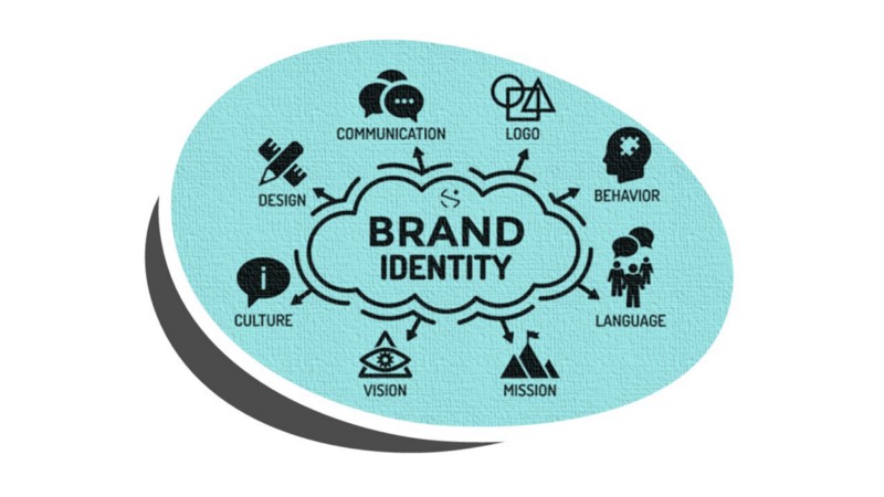
1. Focus on Brand Identity
It is amongst the best ecommerce practices to vocalize your brand identity when it comes to UX design. Ensure that the text, visual content, and everything else on your web page delivers the mission and vision of your platform. Simultaneously, do not forget your audience’s interests. Focus on website personalization for an increase in sales and ROI.
2. Optimize Web Design for Smoother Navigation
Did you get your website designed ages ago? Does it still have pages of pages that seem to confuse your audience?
Well, if so, you need to get your web redesigned. You can get it done using newer, more efficient web development technologies like Laravel or Jamstack.
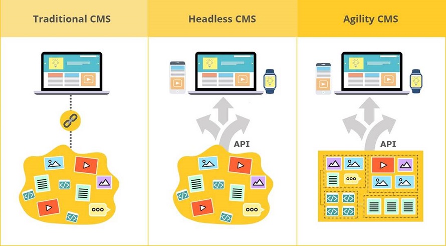
In the past five years, JAMstack has seen meteoric growth, going from a relatively small, obscure tech stack to one of the fastest-growing architectures. In a nutshell, the catalyst that has led to JAMstack mass adoption are the changing web development trends. These include transitioning from monolithic web applications to apps created using decoupled architecture that relies on APIs microservices.
With JAMstack, complex monolithic apps can be now broken down into small, independent components that can be easily managed and understood. By the same token, the introduction of serverless architecture has also created a need for JAMstack, as the stack works perfectly for building lightweight, blazing-fast apps that can be scaled independently.
A Jamstack friendly Headless CMS like Agility CMS with Page Management

3. Offer a Smart Search Function
Since you've got an ecommerce platform, the search bar is more of a necessity to your website than an option. You've got hundreds and thousands of products listed on your website. You cannot expect the user to go through each, one by one, to find their desired product, especially in this age when everything's available at one click. Hence, equip your website with a smart search function, wherein they can accurately find the desired product. You can also use SEMrush for keyword research, rank tracking, and complete product analysis.
4. Use Specific Search Filters
You can further optimize the search option by including filters. Some of the common filters used by ecommerce sites include brand, price, colors, age, sizes, warranty, etc. You can opt for the ones specific to your range of products.
5. Direct them to Similar Products
At times, the user will end up finding the exact product they wanted. But, for some reason, it wouldn't click, and they wouldn't make their purchase. Now, you can't let your customer walk out unsatisfied like that. Can you?
To keep this from happening, including a section of You May Also Like. You can include this at the bottom of the page or on the side panel. Just make sure it's in a position that can't and won't go unnoticed. In this way, you'll be suggesting more options to the user without being clingy. Now that's called some smart sales strategies with smart UX design!
Learn more about Personalization In Ecommerce.
6. Incorporate CTA buttons
Including Call-to-Action phrases in your web page's text is important, but old-school. Now, the advanced designing tools offer interactive CTA buttons which are much more convincing than the plain text. What you can do is, embellish your webpage with persuasive slogans and embed the button right below that. Just take care you don't add up too many of these, as they can become annoying for the user.
7. Offer True Product Evaluation
Apart from written content, your audience will assess the product through visual content. And this is where your UX strategies and principles come into play.
You ought to offer high-quality images to your audience from all possible angles that they'd wish to evaluate the product from. Plus, you can offer zoom-in photographs as well as animations and videos. The better you present your products, the more traffic you will get.
8. Earn their Trust
Most online buyers are still very skeptical of the technology they use. They do not want to risk their personal information, yet they want to shop. Do you see the situation here?
You can ease it out for them by offering safer payment methods. Perhaps, via reliable and recognized third-party apps and sites.
9. Cut Down the Formalities
Another factor that bothers your clientele is the abundance of questions at the end of the purchase. You may ask for verification once, but multiple forms and redirections annoy users. Hence, we recommend optimizing UX using React JS or Laravel to develop easier and concise signup forms and confirmation pages.
10. Answer Basic Queries
For first-time visitors, we recommend including an FAQ section wherein you should answer common queries. You can acquire these questions via personal feedback or observe the activity and performance of your website to determine the points of confusion.
Bonus
Check out this practical workshop about adding a Shopping cart Snipcart to your ecommerce website:
Final thoughts
Now, of course, there’s no fixed strategy or formula for improving the UX of your website. There are a hundred different approaches. And all of these may not work for your website. Maybe SEMrush clicks, but Laravel doesn’t. To figure this, we’d suggest you conduct thorough research and make calculated decisions with the assistance of your team or other experienced individuals.
About the author:
Arslan Hassan is an electrical engineer with a passion for writing, designing, and anything tech-related. His educational background in the technical field has given him the edge to write on many topics.
Keep Learning
If you want to learn more about why Agility CMS is faster, make sure you read these articles:


