How Great Ecommerce UX Design Can Help Convert More Visitors

Driving ROI with UX
Juliette Anderson
Juliette Anderson
Sep 21, 2021
UX design to convert leads on agilitycms.com

Having thousands of website visitors does not determine ecommerce success. Instead, you should look into how many of your site visitors end up buying your products.

Next is to examine how you can encourage more and more visitors to convert. Often, people do not end up buying from you because they do not know how. And those who know find it cumbersome to complete the process.

This is where user experience (UX) comes in.

UX refers to the overall experiences of a person on your website. When you make it easy for them to search and buy your products, that means that your e-commerce site has excellent UX. In addition, it can help boost your sales.

This also explains why UX is essential for ecommerce website.

UX design for ecommerce on agilitycms.com

Importance of UX Design in Ecommerce

User experience is vital since it helps an online customer stay on your website and make a purchase. It also fosters customer loyalty.

Meaning, they would rather shop in your online store because you make it easy for them to do so. Mind you, customer retention allows you to reduce your marketing budget while continuously increasing your sales.

How can you make it easy for site visitors to become customers? Well, make sure they know what to do and where to look as soon as they land on your website. It can be as simple as adding "SHOP" to your navigation menu.

That said, here are six reasons UX is essential to e-commerce:


Improves Online Visibility

A great UX design helps with search engine optimization (SEO.) This means that you're able to attract more organic traffic to your ecommerce site. Having a user-friendly interface, a robust site structure, and quality content lets you achieve this.

Having a great UX design makes you more popular with your target audience as well. Since social media share buttons are often included with a great UX design, people can share and tell their friends about it. As a result, you'll get free advertising, and your site will also gain more popularity.

This eventually improves your internet visibility, which allows you to gain more visitors and conversions in the long run.
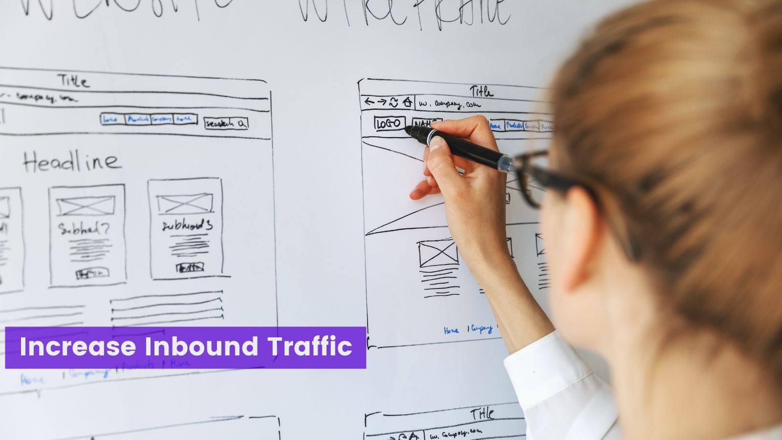
 Increase inbound traffic with UX on agilitycms.com

Builds Brand Trust

A great UX design will also make your clients feel more at ease and repeatedly return to your site.

This will eventually help build the credibility of your brand, which is crucial if you want to stand out from the competition.

Apart from that, your online reputation also plays a crucial role in generating additional leads and revenues. That's why you must work with a professional designer that will help you achieve these goals.

You also need to know that customer loyalty goes hand in hand with establishing credibility and trust. Your commitment to your customers will result in them being loyal to you.

That's why you must maintain and build a strong relationship with them. You can empathize with them by anticipating their problems and what they feel during the different stages of the purchase cycle.

Don't hesitate to take your time to address these issues. Often, this fosters meaningful relationships between you and your customers.


Build Customer Satisfaction

According to a study by Baymard, approximately 69,2 percent of customers abandon a cart. The research found that one of the reasons customers leave without purchasing anything lies in the web design and check-out flow.

As such, a recipe for a bad UX design includes the following: 

  • Confusing web navigation
  • Vague website layout
  • Imprecise product description
  • Missing call-to-action

Negative UX will push your customers directly to your competitors. Meanwhile, if you provide your customers with a great experience, then they'll likely end up purchasing your products.

So, the sooner that you fix this bad UX, the more likely it is that you'll bring your customers closer to your business.

Because of the excellent service you offer, you'll generate more sales, see a rise in conversions, and more repeat and loyal customers.

Enhance Customer Engagement

An attractive UX design is everything for users that are visiting your site.

You can provide users with a great layout with content that engages them and provides easy navigation.

Usually, going with a simple, uncluttered design will grab the user's attention. This can also make the whole user experience more memorable, setting you apart from the rest of the pack.

Ideally, your site design and the colors you use on the design should be strategic as well. It should be telling a story that connects well with users.

One of the primary benefits of user experience is that you'll get more loyal customers in the long run. Most likely, they'll check you out and buy from you again because of the excellent user experience you've provided. By doing so, you're able to understand your audience better.

This can also help automatically increase the traffic on your site by a margin.

Increase Site Usability

Users expect particular pieces of information and opportunities for action at the right time.

A great UX design will make it easy for them to make decisions without spending a lot of effort looking for what they need.

For example, you make it easy for users to create an account by only asking for their name and email. This requires minimal effort on the users' end, making it much more convenient for them. You're also opening the door for future interactions.
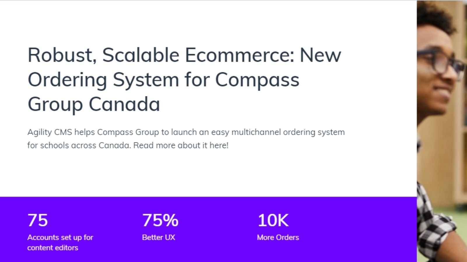
 UX team increasing conversions on agilitycms.com

Expands Your Market Reach with a Mobile-friendly Design

Approximately 68% of the world owns a mobile device, and 52% of internet searches are done on mobile. That's why you could be missing out on half of your potential market if you lack a mobile-friendly version of your site.

The thing is, many mobile users are expecting to gain access and navigate your site as if they're using a PC.

Sure, the majority of your customers will most likely buy from a mobile-friendly site. But a lot of them will leave your site altogether once they've encountered a problem.

7 Ways to Improve UX Design of Any Website

Now that you know the benefits an excellent UX design can bring to your e-commerce business, let us walk you through seven tips to improve your online store's UX.

Design for Accessibility

You need to ensure that disabled site visitors can safely and conveniently navigate your site.

This isn't just the most helpful thing you can do to work on your site's UX, as this is a legal requirement. You can potentially be sued if you have a site that doesn't meet accessibility standards.

So, ensure that all navigation and form elements can be accessed with a keyboard. Your site should also include information that will help screen readers.

Use Creative and Clear Call-to-Action

Hopefully, you have an enticing product that can quell your customers' anti-purchasing thoughts. However, this doesn't always happen.

People will have several reasons why they don't want to buy something. That's why the most successful e-commerce sites make their call-to-actions a main priority. This builds a sense of scarcity and urgency in the mind of your customers. 

Just be careful to stay away from using bland CTAs, though, like "submit" or "purchase now.

Make sure that you come up with a CTA copy that will make your visitors think they need to make this purchase immediately. You can do this by capitalizing on a deal they can't miss or a new product launch that's selling out quickly.

 Creating CTAs in UX on agilitycms.com

Create Engaging and Action-Oriented Content

We know that visual data is processed a lot faster by the brain than text.

However, one of the most significant advantages of using visuals is that these can make a site or an app a pleasure to use. Why? Simply because they're a lot more engaging than huge chunks of texts!

Make sure that your content is engaging. Add a video if that can help. And then pair it with a relevant call-to-action. That way, you can quickly motivate your visitors to become loyal customers.

Get Rid of Friction in the Navigation

Most web and landing pages have a primary goal, and that is to convert visitors. Hence, it would be best to get rid of the navigation menu. Doing so reduces the distraction, which will prevent a site visitor from converting.

The thing with a navigation menu is that they temp site visitors to click away. This is something we do not want to happen. If anything, we would want them to click a CTA button like "Add to Cart."

By getting rid of the navigation bar on the landing page, users won't be bombarded with competing decisions that they need to make. It makes their minds more at ease since they're able to focus only on a single task.

So, make sure that you declutter your landing pages to get higher conversion rates in the long run.

Streamline the Check-out Process

Have you wondered why many people are bailing out on prospective purchases during check-out?

While some of it is unavoidable because of impulsive purchases, it might be the final price that scares prospective customers. Or it could also be the unnecessary hassles that a potential customer goes through during check-out.

To prevent this, you must expedite your check-outs and registrations. Doing so improves your conversion rate and enhances your sales.

The thing is the more time that you let a person dwell on the purchase, the less likely it is that they'll go through with it.

So, let's say that someone from your website wants to purchase a specific product. Then, it would help if you did so, with very little resistance as possible. Make the check-out process completely stress-free. Don't ask prospects to log in or make an account before they can proceed with the purchase.

An excellent way to streamline your check-out process is to offer guest check-outs.

If you need new customers to create an account before buying something, allow a Google or Facebook social log-in. That way, it won't take them all day to register on your site.

Doing so helps speed up the process. That's because they do not need to fill in a long sign-up form. This will lead to bigger cart sizes and higher conversion rates.
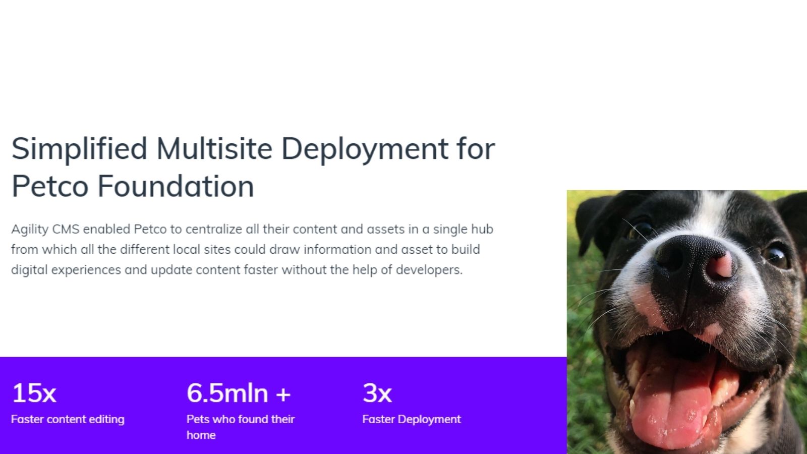
 Expediting checkouts with UX on agilitycms.com

Improve Page Load Speed

Speed is one of the determining factors whether or not your site has a great UX. The thing is, slower websites suffer more conversion losses than those that load blazingly fast. This can even affect your organic rankings, as well.

So, how will you know if your site is loading fast enough? According to a study, 53% of mobile site visits are abandoned if it takes a page to load more than three seconds.

The last thing that you want is to lose your leads because your site has poor UX and is loading slow. To check how fast your site loads, you can use handy tools like Google's PageSpeed Insights.

Show, Don't Tell

You also need to know how awesome you are. That way, customers will fall in love with your business.

However, a lot of companies today are focusing more on marketing rather than being customer-centric.

It would be best if you showcased positive customer reviews and testimonials. That way, it's easier for prospects to believe your claims. You also need to incorporate various elements like your customers' pain points, solutions, and outcomes.

You'll have a better idea of how your product can benefit your customers in the long run. 

Over to You

Keep in mind that a great UX design is more than just aesthetics. Instead, it is about making it easy for site visitors to do their tasks. In this case, that would be coaxing them to buy your products.

That said, always check how site visitors are interacting with your online store. If you see many abandoned carts, that could mean that there is something in your check-out process that is stopping them. There, make the necessary tweaks and see whether your abandoned carts are decreasing.

Regardless, the secret to an excellent UX design is ensuring that you are providing the best online experience to your customers.

Learn more: 

What Ecommerce Content Marketing Strategies are Driving ROI? (agilitycms.com)

Ways to Impress Ecommerce Customers | Agility CMS

Benefits of CRM for Ecommerce & Retail Business | Agility CMS

About the Author:

Juliette Anderson is an Outreach Community Specialist for an e-commerce fulfillment company that specializes in partnering with online sellers who have an average parcel weight of 5+ pounds or greater. She works hand-in-hand with e-commerce stores to achieve optimal sales for four years already. Her specialty lies in social media marketing and paid promotions.

Back to All Articles
Sep 21, 2021

How Great Ecommerce UX Design Can Help Convert More Visitors

Driving ROI with UX

Juliette Anderson
UX design to convert leads on agilitycms.com

Having thousands of website visitors does not determine ecommerce success. Instead, you should look into how many of your site visitors end up buying your products.

Next is to examine how you can encourage more and more visitors to convert. Often, people do not end up buying from you because they do not know how. And those who know find it cumbersome to complete the process.

This is where user experience (UX) comes in.

UX refers to the overall experiences of a person on your website. When you make it easy for them to search and buy your products, that means that your e-commerce site has excellent UX. In addition, it can help boost your sales.

This also explains why UX is essential for ecommerce website.

UX design for ecommerce on agilitycms.com

Importance of UX Design in Ecommerce

User experience is vital since it helps an online customer stay on your website and make a purchase. It also fosters customer loyalty.

Meaning, they would rather shop in your online store because you make it easy for them to do so. Mind you, customer retention allows you to reduce your marketing budget while continuously increasing your sales.

How can you make it easy for site visitors to become customers? Well, make sure they know what to do and where to look as soon as they land on your website. It can be as simple as adding "SHOP" to your navigation menu.

That said, here are six reasons UX is essential to e-commerce:


Improves Online Visibility

A great UX design helps with search engine optimization (SEO.) This means that you're able to attract more organic traffic to your ecommerce site. Having a user-friendly interface, a robust site structure, and quality content lets you achieve this.

Having a great UX design makes you more popular with your target audience as well. Since social media share buttons are often included with a great UX design, people can share and tell their friends about it. As a result, you'll get free advertising, and your site will also gain more popularity.

This eventually improves your internet visibility, which allows you to gain more visitors and conversions in the long run.

 Increase inbound traffic with UX on agilitycms.com

Builds Brand Trust

A great UX design will also make your clients feel more at ease and repeatedly return to your site.

This will eventually help build the credibility of your brand, which is crucial if you want to stand out from the competition.

Apart from that, your online reputation also plays a crucial role in generating additional leads and revenues. That's why you must work with a professional designer that will help you achieve these goals.

You also need to know that customer loyalty goes hand in hand with establishing credibility and trust. Your commitment to your customers will result in them being loyal to you.

That's why you must maintain and build a strong relationship with them. You can empathize with them by anticipating their problems and what they feel during the different stages of the purchase cycle.

Don't hesitate to take your time to address these issues. Often, this fosters meaningful relationships between you and your customers.


Build Customer Satisfaction

According to a study by Baymard, approximately 69,2 percent of customers abandon a cart. The research found that one of the reasons customers leave without purchasing anything lies in the web design and check-out flow.

As such, a recipe for a bad UX design includes the following: 

  • Confusing web navigation
  • Vague website layout
  • Imprecise product description
  • Missing call-to-action

Negative UX will push your customers directly to your competitors. Meanwhile, if you provide your customers with a great experience, then they'll likely end up purchasing your products.

So, the sooner that you fix this bad UX, the more likely it is that you'll bring your customers closer to your business.

Because of the excellent service you offer, you'll generate more sales, see a rise in conversions, and more repeat and loyal customers.

Enhance Customer Engagement

An attractive UX design is everything for users that are visiting your site.

You can provide users with a great layout with content that engages them and provides easy navigation.

Usually, going with a simple, uncluttered design will grab the user's attention. This can also make the whole user experience more memorable, setting you apart from the rest of the pack.

Ideally, your site design and the colors you use on the design should be strategic as well. It should be telling a story that connects well with users.

One of the primary benefits of user experience is that you'll get more loyal customers in the long run. Most likely, they'll check you out and buy from you again because of the excellent user experience you've provided. By doing so, you're able to understand your audience better.

This can also help automatically increase the traffic on your site by a margin.

Increase Site Usability

Users expect particular pieces of information and opportunities for action at the right time.

A great UX design will make it easy for them to make decisions without spending a lot of effort looking for what they need.

For example, you make it easy for users to create an account by only asking for their name and email. This requires minimal effort on the users' end, making it much more convenient for them. You're also opening the door for future interactions.

 UX team increasing conversions on agilitycms.com

Expands Your Market Reach with a Mobile-friendly Design

Approximately 68% of the world owns a mobile device, and 52% of internet searches are done on mobile. That's why you could be missing out on half of your potential market if you lack a mobile-friendly version of your site.

The thing is, many mobile users are expecting to gain access and navigate your site as if they're using a PC.

Sure, the majority of your customers will most likely buy from a mobile-friendly site. But a lot of them will leave your site altogether once they've encountered a problem.

7 Ways to Improve UX Design of Any Website

Now that you know the benefits an excellent UX design can bring to your e-commerce business, let us walk you through seven tips to improve your online store's UX.

Design for Accessibility

You need to ensure that disabled site visitors can safely and conveniently navigate your site.

This isn't just the most helpful thing you can do to work on your site's UX, as this is a legal requirement. You can potentially be sued if you have a site that doesn't meet accessibility standards.

So, ensure that all navigation and form elements can be accessed with a keyboard. Your site should also include information that will help screen readers.

Use Creative and Clear Call-to-Action

Hopefully, you have an enticing product that can quell your customers' anti-purchasing thoughts. However, this doesn't always happen.

People will have several reasons why they don't want to buy something. That's why the most successful e-commerce sites make their call-to-actions a main priority. This builds a sense of scarcity and urgency in the mind of your customers. 

Just be careful to stay away from using bland CTAs, though, like "submit" or "purchase now.

Make sure that you come up with a CTA copy that will make your visitors think they need to make this purchase immediately. You can do this by capitalizing on a deal they can't miss or a new product launch that's selling out quickly.

 Creating CTAs in UX on agilitycms.com

Create Engaging and Action-Oriented Content

We know that visual data is processed a lot faster by the brain than text.

However, one of the most significant advantages of using visuals is that these can make a site or an app a pleasure to use. Why? Simply because they're a lot more engaging than huge chunks of texts!

Make sure that your content is engaging. Add a video if that can help. And then pair it with a relevant call-to-action. That way, you can quickly motivate your visitors to become loyal customers.

Get Rid of Friction in the Navigation

Most web and landing pages have a primary goal, and that is to convert visitors. Hence, it would be best to get rid of the navigation menu. Doing so reduces the distraction, which will prevent a site visitor from converting.

The thing with a navigation menu is that they temp site visitors to click away. This is something we do not want to happen. If anything, we would want them to click a CTA button like "Add to Cart."

By getting rid of the navigation bar on the landing page, users won't be bombarded with competing decisions that they need to make. It makes their minds more at ease since they're able to focus only on a single task.

So, make sure that you declutter your landing pages to get higher conversion rates in the long run.

Streamline the Check-out Process

Have you wondered why many people are bailing out on prospective purchases during check-out?

While some of it is unavoidable because of impulsive purchases, it might be the final price that scares prospective customers. Or it could also be the unnecessary hassles that a potential customer goes through during check-out.

To prevent this, you must expedite your check-outs and registrations. Doing so improves your conversion rate and enhances your sales.

The thing is the more time that you let a person dwell on the purchase, the less likely it is that they'll go through with it.

So, let's say that someone from your website wants to purchase a specific product. Then, it would help if you did so, with very little resistance as possible. Make the check-out process completely stress-free. Don't ask prospects to log in or make an account before they can proceed with the purchase.

An excellent way to streamline your check-out process is to offer guest check-outs.

If you need new customers to create an account before buying something, allow a Google or Facebook social log-in. That way, it won't take them all day to register on your site.

Doing so helps speed up the process. That's because they do not need to fill in a long sign-up form. This will lead to bigger cart sizes and higher conversion rates.

 Expediting checkouts with UX on agilitycms.com

Improve Page Load Speed

Speed is one of the determining factors whether or not your site has a great UX. The thing is, slower websites suffer more conversion losses than those that load blazingly fast. This can even affect your organic rankings, as well.

So, how will you know if your site is loading fast enough? According to a study, 53% of mobile site visits are abandoned if it takes a page to load more than three seconds.

The last thing that you want is to lose your leads because your site has poor UX and is loading slow. To check how fast your site loads, you can use handy tools like Google's PageSpeed Insights.

Show, Don't Tell

You also need to know how awesome you are. That way, customers will fall in love with your business.

However, a lot of companies today are focusing more on marketing rather than being customer-centric.

It would be best if you showcased positive customer reviews and testimonials. That way, it's easier for prospects to believe your claims. You also need to incorporate various elements like your customers' pain points, solutions, and outcomes.

You'll have a better idea of how your product can benefit your customers in the long run. 

Over to You

Keep in mind that a great UX design is more than just aesthetics. Instead, it is about making it easy for site visitors to do their tasks. In this case, that would be coaxing them to buy your products.

That said, always check how site visitors are interacting with your online store. If you see many abandoned carts, that could mean that there is something in your check-out process that is stopping them. There, make the necessary tweaks and see whether your abandoned carts are decreasing.

Regardless, the secret to an excellent UX design is ensuring that you are providing the best online experience to your customers.

Learn more: 

What Ecommerce Content Marketing Strategies are Driving ROI? (agilitycms.com)

Ways to Impress Ecommerce Customers | Agility CMS

Benefits of CRM for Ecommerce & Retail Business | Agility CMS

About the Author:

Juliette Anderson is an Outreach Community Specialist for an e-commerce fulfillment company that specializes in partnering with online sellers who have an average parcel weight of 5+ pounds or greater. She works hand-in-hand with e-commerce stores to achieve optimal sales for four years already. Her specialty lies in social media marketing and paid promotions.

About the Author
Juliette Anderson

Take the next steps

We're ready when you are. Get started today, and choose the best learning path for you with Agility CMS.

Get startedRequest a Demo