Top Ecommerce Web Design Trends that Boost Sales

With Ecommerce Inspiration Examples

Mehul Rajput
Mehul Rajput
Jun 21, 2021
Top Ecommerce Web Design Trends that Boost Sales

There are many reasons that are responsible for the malfunction of a website, which causes low sales. From broken links and slow-loading pages to problematic checkout procedures and unresponsive designs – the reason can be any. But have you thought that your website design might be an issue?

Everything changes quickly in this digital era. New trends will keep coming and if you don’t follow them, you may lose your potential clients and sales. An eCommerce website design must be good enough to make a great customer experience. And combined with some great services and products, you can easily increase your online sales.

Just remember to keep the design easy to navigate and simple and at the same time visually attractive while following the latest trends. Before checking out the latest eCommerce website design trends for 2021, let’s just take a look at some design stats below!

  • 94% of all first impressions are made depending on the website design.
  • 75% of people make an opinion about a website based on its design and aesthetics.
  • 38% of people will stop browsing a website if its layout or content is not appealing.
  • 2 out of 3 people like to browse through a well-designed website.

This data showcases that people judge a brand on the basis of its website design and beautification. Hence, if the web design is unappealing, users would instead leave it, regardless of how good products you provide. To avoid such issues, you should maintain your design aesthetics and follow the latest trends.

Let’s delve into the newest eCommerce website design trends for 2021!

Top 15 eCommerce Website Design Trends

1. Vaporwave Aesthetic

The impact of vaporwave is going restlessly popular among 2021 eCommerce web design trends. This has changed from cult status to growing mainstream pop culture. This aesthetic has grown to include surrealism, futurism, and nostalgia as visual art.

Vaporwave Aesthetic

Vaporwave is a blend of retro pop culture elements from the 60s, 70s, 80s, and 90s. In case you don’t feel to use this aesthetic much for your brand, you can choose some particular elements and customize them.

A good option will be using pink glitter background to create an aesthetics atmosphere.

You can also use image filters to give regular pictures this feel.

2. Responsive Design

It’s evident that half of the worldwide eCommerce revenue is produced from mobile devices and 40% of transactions are done through mobile users. And this number will increase as consumers will buy more using their gadgets.

Responsive vs. Mobile-Friendly Websites: What's the Difference?

A mobile-friendly responsive website design is crucial for an eCommerce platform. Therefore, websites should concentrate more on their mobile version than the website.

The benefit of a mobile-friendly design is that you don’t require building a completely different version for your site. The mobile-responsive design adapts automatically to the respective gadget and you just require examining whether the sizes and images are displayed properly.

3. Machine Learning & Chatbots

Earlier, people used to feel hesitant while communicating with chatbots. But these days, things have been changed with the development of AI (Artificial Intelligence) and Machine Learning. Currently, every website uses bots to boost communication between buyers and sellers.

artificial intelligence machine learning deep learning cheap online

This not just helps consumers but also the sales team to be more efficient at discovering potential prospects for the business. The improved communication between your website and customers brings more opportunities for you to develop your brand further.

4. Filter Functions

Filtering product searches should be enough seamless for your customers, so it doesn’t give you a headache. It helps them find precisely what they are searching for. Hence, the trend of fun filter functions comes into the picture with more efficiency. Try to design them in a more fun manner to attract your consumers.

This trend is beyond only helping search filters, product tags, and categories. Moreover, it encompasses a memorable and intuitive display. General drop-down menus may facilitate navigation, but they will not attract anyone. Hence, try to present your filters both effectively and entertainingly.

5. 3D Animation

3D animation can be highly helpful as you can display your item from various viewpoints. Moreover, the design is engaging and allures the attention of consumers. Most of the time people don’t care to read the product descriptions, but they find a 3D model interesting and easy to navigate.

If you need some inspiration follow sci-fi writer K.Leigh on Linkedin.

No alternative text description for this image

6. Minimalism

A minimalistic UI design approach is not just one of the latest trends but also advantages currently. Some websites perform perfectly with complex features, but a minimalistic website will be more beneficial for your business. After all, users don’t feel comfortable exploring a complexly designed website.

Minimalist Web Design: How To Achieve More With Less — Web Design

Also, a minimalistic approach to a website works as a guide to the users. Users will find the simple site easy to navigate, conduct product searches, and discover the info they are searching for.

7. White Space Frames

Making your eCommerce website flooded with infographics and visuals is not a good idea. Adding lots of visuals to a website does not make it attractive anymore. In 2021, white space frames will attract the attention of many eCommerce websites as this is the most effective way to offer an eCommerce site a well-hierarchical structure.

White space design - 20 striking examples and best practices - Justinmind

With a white space frame, you can give a more professional and cleaner design to your eCommerce website that can attract more consumers. The white space makes breathing space in a website, which makes it simpler for users to identify and understand your website content. Use white space frames to individualize all products and make the category page look more appealing.

8. Unconventional Layouts

Now more brands are exploring unconventional layouts, such as asymmetrical ones or created in a horizontal scroll form. They look more engaging and dynamic and help highlight your brand’s exclusiveness. Moreover, they give scope to emphasize some particular products without overloading website pages with lots of visual accents.

Web Design Trends 2018 - Part 2 - Idea Theorem

This trend works superbly with e-shops that have a limited number of items. In case your e-store has many products to showcase, you should better implement the traditional grid layout; else, they will take lots of space and make it tough for users.

9. Neutral Background Colors

Gone are the days when we used to see the plain old white background color of an eCommerce website design. Now, we can see unique neutral colors like warm cream, cool grays, soft browns, sand tones, taupes, and pale yellows.

The Futur on Twitter: "Broken Grid Layouts in Web Design Harmony and logic  are a constraint to creativity, sometimes. In Broken Grids, images and text  overlap, creating something unique, assymetrical and beautiful. #

A pale background palette is beneficial because it can keep the focus on other visuals, especially product videos and images. Moreover, it offers a more pleasant, softer user experience.

10. Hamburger Menu

The Hamburger menu is the icons created up to 3 parallel lines. Generally, these are found at a website’s top right or top left part. Once a user clicks the icon, he/she will get a different menu, which will enable them to navigate the website.

Menu Icons 🍔 | Hamburger menu icon, Kebab, Hamburger menu

Website designers named it differently, such as the side menu, the options button, Contact, FAQ, etc. All of these perform some specific functions. In short, it makes the website navigation easier and keeps users connected to the website.

11. Dark Mode

The dark mode is another trending website design that helps grab customers’ attention and boost sales. Some eCommerce sites offer dark mode features to enable their consumers to spend more time on their apps and websites. Adding a dark mode to your website can be a great option if you want to enhance your website UI.

Check out our Dark Mode Page For Developers:

dark mode

This feature enables users to change the website or app background to black that reduces the eye strain when users spend more time on various websites. Since the background pixels are turned off, it will eliminate the battery life also.

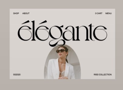
12. Ovals

Ovals are the new aesthetic web design trend that takes a post-modern appeal to the classic circle. Designers prefer using them for namely buttons, focal points, and image frames. However, you don’t need to use a complete oval. Usually, designers use oval-rectangle combinations, like a chapel window shape with squared bottom and a rounded top or a box with rounded corners.

Generally, curves and ovals are graphic design tactics to make an image look more welcoming and friendly. Hence, they are ideal for brands that do not want to be very objectless in a formal ambiance.

13. The Combination of Product Pages and Landing Pages

Nowadays, customers usually come from a SERP page, a social media post, or an advertisement that directly promotes the category or product page. For this reason, more online sellers design their category or product pages with the landing page elements like social proof, calls-to-action, hero shots, unique selling propositions, etc.

This helps customers get all info they require about the e-shop and the product is displayed more informatively and flatteringly. Landing pages are expected to convert 25% more.

14. Micro-Interaction Technology

The small communications between a website and a specific user are known as micro-interactions. These interactions help users achieve some tasks by working like directions. Moreover, these help users get the essential feedback or consequence of an action they performed on the website, inform users after finishing a task, make users stay connected with a website, and prevent errors of operation by showcasing users all steps of the procedure.

User Experience 101: Microinteractions and the small gesture revolution

Thereby, the use of micro-interactions could be a purpose of a user to navigate to your site. Additionally, you will get the strength to impact a user to make faster decisions that are favorable to you.

15. Visual Commerce

Online buyers don’t get the same visual experience as in physical shops. Simple graphics and plain texts offer more engaging and complex options like interactive content, customer-produced media, augmented reality, and engaging videos. Modern technologies made it available for small businesses also.

Advanced visuals provide more details on what you can expect from the products yielding higher rates of conversions and fewer returns. Augmented Reality has become more important now, as businesses are trying to adapt to the effects of the COVID-19.

Takeaway

The eCommerce industry is getting more advanced day by day. Hence, this is the right time to opt for the best communication strategy, best technology, and best website design to make the website more productive and effective. Now all consumers expect the best experience while buying online. So, in case you cannot satisfy them, they won’t come back to your eCommerce site, regardless of how new or old it is.

Following the latest eCommerce website design trends will not just help you grab your consumers’ attention but also increase conversion and client acquisition rate. You can follow the trends I have listed above to take a step ahead of your rivals. Experimentation with these trends on your site will help you optimize your site’s navigation and appearance.

Hence, just choose the trends and go ahead with them to acquire your customers’ trust and establish a powerful relationship with them.

Author Bio

Mehul Rajput is a CEO and co-founder of MindInventory, a software development company that provide web and mobile app development solutions from startup to enterprise level company. His role involves heading the operations related to business and delivery with strategic planning and defining road-map for the future.

Read more about ecommerce:

10 Unusual Ways to Impress Ecommerce Customers and Stand Out from Competitors

6 Important Benefits of CRM for Ecommerce and Retail Business

How To Use Content For Increasing Ecommerce Sales

Back to All Articles
Jun 21, 2021

Top Ecommerce Web Design Trends that Boost Sales

With Ecommerce Inspiration Examples
Mehul Rajput
Top Ecommerce Web Design Trends that Boost Sales

There are many reasons that are responsible for the malfunction of a website, which causes low sales. From broken links and slow-loading pages to problematic checkout procedures and unresponsive designs – the reason can be any. But have you thought that your website design might be an issue?

Everything changes quickly in this digital era. New trends will keep coming and if you don’t follow them, you may lose your potential clients and sales. An eCommerce website design must be good enough to make a great customer experience. And combined with some great services and products, you can easily increase your online sales.

Just remember to keep the design easy to navigate and simple and at the same time visually attractive while following the latest trends. Before checking out the latest eCommerce website design trends for 2021, let’s just take a look at some design stats below!

  • 94% of all first impressions are made depending on the website design.
  • 75% of people make an opinion about a website based on its design and aesthetics.
  • 38% of people will stop browsing a website if its layout or content is not appealing.
  • 2 out of 3 people like to browse through a well-designed website.

This data showcases that people judge a brand on the basis of its website design and beautification. Hence, if the web design is unappealing, users would instead leave it, regardless of how good products you provide. To avoid such issues, you should maintain your design aesthetics and follow the latest trends.

Let’s delve into the newest eCommerce website design trends for 2021!

Top 15 eCommerce Website Design Trends

1. Vaporwave Aesthetic

The impact of vaporwave is going restlessly popular among 2021 eCommerce web design trends. This has changed from cult status to growing mainstream pop culture. This aesthetic has grown to include surrealism, futurism, and nostalgia as visual art.

Vaporwave Aesthetic

Vaporwave is a blend of retro pop culture elements from the 60s, 70s, 80s, and 90s. In case you don’t feel to use this aesthetic much for your brand, you can choose some particular elements and customize them.

A good option will be using pink glitter background to create an aesthetics atmosphere.

You can also use image filters to give regular pictures this feel.

2. Responsive Design

It’s evident that half of the worldwide eCommerce revenue is produced from mobile devices and 40% of transactions are done through mobile users. And this number will increase as consumers will buy more using their gadgets.
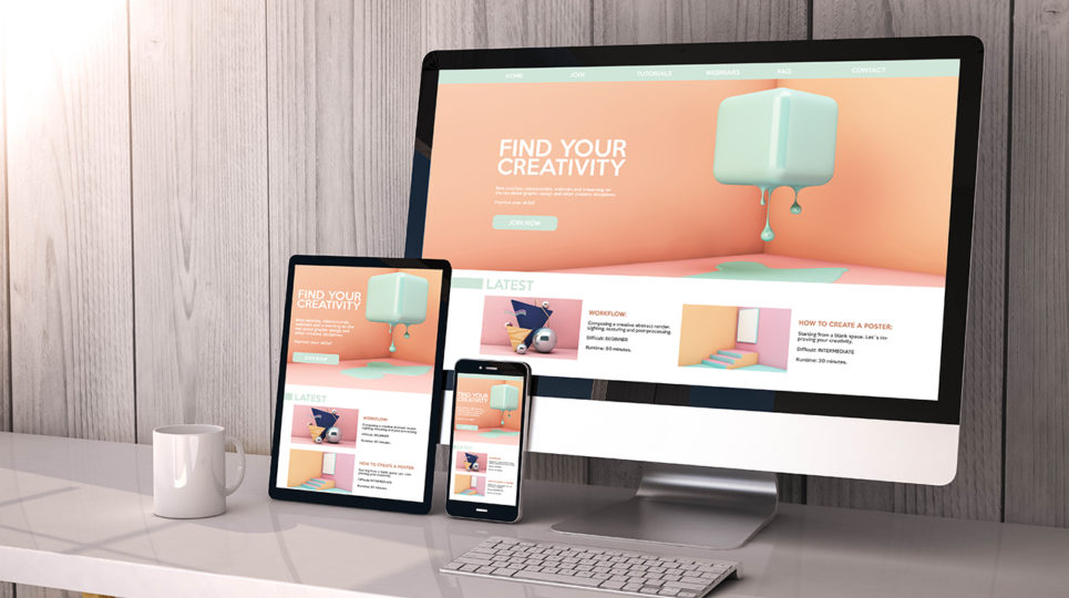
Responsive vs. Mobile-Friendly Websites: What's the Difference?

A mobile-friendly responsive website design is crucial for an eCommerce platform. Therefore, websites should concentrate more on their mobile version than the website.

The benefit of a mobile-friendly design is that you don’t require building a completely different version for your site. The mobile-responsive design adapts automatically to the respective gadget and you just require examining whether the sizes and images are displayed properly.

3. Machine Learning & Chatbots

Earlier, people used to feel hesitant while communicating with chatbots. But these days, things have been changed with the development of AI (Artificial Intelligence) and Machine Learning. Currently, every website uses bots to boost communication between buyers and sellers.

artificial intelligence machine learning deep learning cheap online

This not just helps consumers but also the sales team to be more efficient at discovering potential prospects for the business. The improved communication between your website and customers brings more opportunities for you to develop your brand further.

4. Filter Functions

Filtering product searches should be enough seamless for your customers, so it doesn’t give you a headache. It helps them find precisely what they are searching for. Hence, the trend of fun filter functions comes into the picture with more efficiency. Try to design them in a more fun manner to attract your consumers.

This trend is beyond only helping search filters, product tags, and categories. Moreover, it encompasses a memorable and intuitive display. General drop-down menus may facilitate navigation, but they will not attract anyone. Hence, try to present your filters both effectively and entertainingly.

5. 3D Animation

3D animation can be highly helpful as you can display your item from various viewpoints. Moreover, the design is engaging and allures the attention of consumers. Most of the time people don’t care to read the product descriptions, but they find a 3D model interesting and easy to navigate.

If you need some inspiration follow sci-fi writer K.Leigh on Linkedin.

No alternative text description for this image

6. Minimalism

A minimalistic UI design approach is not just one of the latest trends but also advantages currently. Some websites perform perfectly with complex features, but a minimalistic website will be more beneficial for your business. After all, users don’t feel comfortable exploring a complexly designed website.

Minimalist Web Design: How To Achieve More With Less — Web Design

Also, a minimalistic approach to a website works as a guide to the users. Users will find the simple site easy to navigate, conduct product searches, and discover the info they are searching for.

7. White Space Frames

Making your eCommerce website flooded with infographics and visuals is not a good idea. Adding lots of visuals to a website does not make it attractive anymore. In 2021, white space frames will attract the attention of many eCommerce websites as this is the most effective way to offer an eCommerce site a well-hierarchical structure.
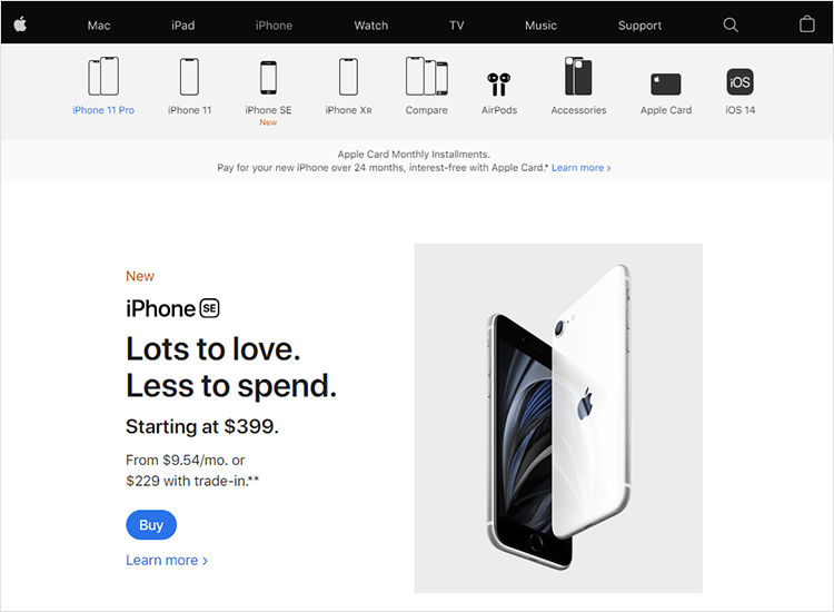
White space design - 20 striking examples and best practices - Justinmind

With a white space frame, you can give a more professional and cleaner design to your eCommerce website that can attract more consumers. The white space makes breathing space in a website, which makes it simpler for users to identify and understand your website content. Use white space frames to individualize all products and make the category page look more appealing.

8. Unconventional Layouts

Now more brands are exploring unconventional layouts, such as asymmetrical ones or created in a horizontal scroll form. They look more engaging and dynamic and help highlight your brand’s exclusiveness. Moreover, they give scope to emphasize some particular products without overloading website pages with lots of visual accents.

Web Design Trends 2018 - Part 2 - Idea Theorem

This trend works superbly with e-shops that have a limited number of items. In case your e-store has many products to showcase, you should better implement the traditional grid layout; else, they will take lots of space and make it tough for users.

9. Neutral Background Colors

Gone are the days when we used to see the plain old white background color of an eCommerce website design. Now, we can see unique neutral colors like warm cream, cool grays, soft browns, sand tones, taupes, and pale yellows.
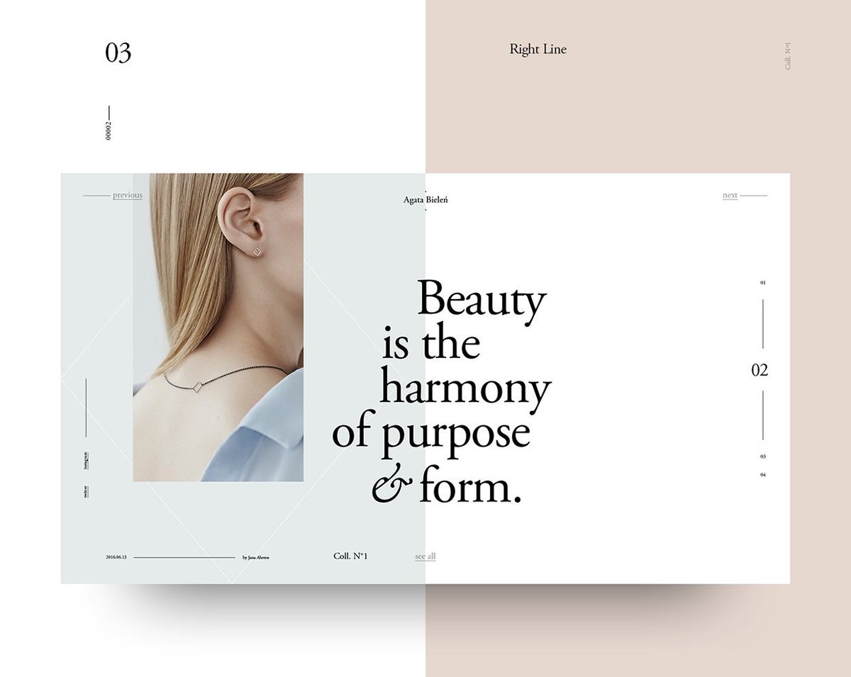
The Futur on Twitter: "Broken Grid Layouts in Web Design Harmony and logic  are a constraint to creativity, sometimes. In Broken Grids, images and text  overlap, creating something unique, assymetrical and beautiful. #

A pale background palette is beneficial because it can keep the focus on other visuals, especially product videos and images. Moreover, it offers a more pleasant, softer user experience.

10. Hamburger Menu

The Hamburger menu is the icons created up to 3 parallel lines. Generally, these are found at a website’s top right or top left part. Once a user clicks the icon, he/she will get a different menu, which will enable them to navigate the website.

Menu Icons 🍔 | Hamburger menu icon, Kebab, Hamburger menu

Website designers named it differently, such as the side menu, the options button, Contact, FAQ, etc. All of these perform some specific functions. In short, it makes the website navigation easier and keeps users connected to the website.

11. Dark Mode

The dark mode is another trending website design that helps grab customers’ attention and boost sales. Some eCommerce sites offer dark mode features to enable their consumers to spend more time on their apps and websites. Adding a dark mode to your website can be a great option if you want to enhance your website UI.

Check out our Dark Mode Page For Developers:

dark mode

This feature enables users to change the website or app background to black that reduces the eye strain when users spend more time on various websites. Since the background pixels are turned off, it will eliminate the battery life also.

12. Ovals

Ovals are the new aesthetic web design trend that takes a post-modern appeal to the classic circle. Designers prefer using them for namely buttons, focal points, and image frames. However, you don’t need to use a complete oval. Usually, designers use oval-rectangle combinations, like a chapel window shape with squared bottom and a rounded top or a box with rounded corners.

Generally, curves and ovals are graphic design tactics to make an image look more welcoming and friendly. Hence, they are ideal for brands that do not want to be very objectless in a formal ambiance.

13. The Combination of Product Pages and Landing Pages

Nowadays, customers usually come from a SERP page, a social media post, or an advertisement that directly promotes the category or product page. For this reason, more online sellers design their category or product pages with the landing page elements like social proof, calls-to-action, hero shots, unique selling propositions, etc.

This helps customers get all info they require about the e-shop and the product is displayed more informatively and flatteringly. Landing pages are expected to convert 25% more.

14. Micro-Interaction Technology

The small communications between a website and a specific user are known as micro-interactions. These interactions help users achieve some tasks by working like directions. Moreover, these help users get the essential feedback or consequence of an action they performed on the website, inform users after finishing a task, make users stay connected with a website, and prevent errors of operation by showcasing users all steps of the procedure.
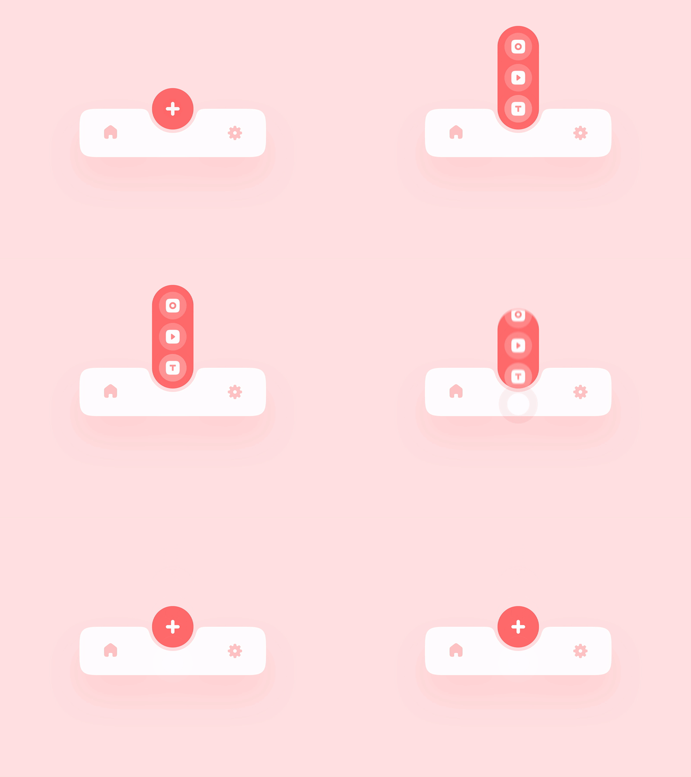
User Experience 101: Microinteractions and the small gesture revolution

Thereby, the use of micro-interactions could be a purpose of a user to navigate to your site. Additionally, you will get the strength to impact a user to make faster decisions that are favorable to you.

15. Visual Commerce

Online buyers don’t get the same visual experience as in physical shops. Simple graphics and plain texts offer more engaging and complex options like interactive content, customer-produced media, augmented reality, and engaging videos. Modern technologies made it available for small businesses also.

Advanced visuals provide more details on what you can expect from the products yielding higher rates of conversions and fewer returns. Augmented Reality has become more important now, as businesses are trying to adapt to the effects of the COVID-19.

Takeaway

The eCommerce industry is getting more advanced day by day. Hence, this is the right time to opt for the best communication strategy, best technology, and best website design to make the website more productive and effective. Now all consumers expect the best experience while buying online. So, in case you cannot satisfy them, they won’t come back to your eCommerce site, regardless of how new or old it is.

Following the latest eCommerce website design trends will not just help you grab your consumers’ attention but also increase conversion and client acquisition rate. You can follow the trends I have listed above to take a step ahead of your rivals. Experimentation with these trends on your site will help you optimize your site’s navigation and appearance.

Hence, just choose the trends and go ahead with them to acquire your customers’ trust and establish a powerful relationship with them.

Author Bio

Mehul Rajput is a CEO and co-founder of MindInventory, a software development company that provide web and mobile app development solutions from startup to enterprise level company. His role involves heading the operations related to business and delivery with strategic planning and defining road-map for the future.

Read more about ecommerce:

10 Unusual Ways to Impress Ecommerce Customers and Stand Out from Competitors

6 Important Benefits of CRM for Ecommerce and Retail Business

How To Use Content For Increasing Ecommerce Sales

About the Author
Mehul Rajput

Take the next steps

We're ready when you are. Get started today, and choose the best learning path for you with Agility CMS.

Get startedRequest a Demo