Best Practices to Create a High-Converting B2B Website
It's time for a website that converts!


In today's competitive market, it's no longer enough to have a great product or service.
You also need an effective website that attracts qualified leads and converts them into customers.
No matter how functional and brilliant your product or service is, without a website, it would be much harder for you to attract customers and gain their trust.
The problem is, not every business has the resources to hire a web designer or developer - which means they're stuck trying to create their own site from scratch.
After all, building a professional B2B website isn't all about choosing the right theme and uploading all the content you have.
Oh, how everyone wishes it's that simple.
In fact, you also need to pay attention to landing pages, metrics, optimization, integrations, just to name a few.
And if you're not careful, this can lead to disaster: A poorly designed B2B website may look unprofessional and discourage visitors from converting-- that may even harm your business online reputation.
To help you out, here are the best practices to create a high-converting B2B website.
What Makes a B2B Website Different?
All websites share the same goal: converting prospects into customers.
That said, as B2B businesses serve fewer buyers, the websites are more focused on lead generation and conversion optimization-- so they can push potential customers towards conversions, than retail or B2C-model websites.
More specifically, it generates leads regularly and in sufficient volume to enable you to grow your business in the long term.
This means that you need to pay close attention to the design of your website, as well as the user experience (UX). You also need fast ecommerce web hosting to ensure your pages load up quickly.
Your website's layout, the images you choose, and the way you word your copy all play a role in how well your site converts visitors into leads.
Remember that good B2B websites are those that keep the customer as the focus of the design process.
Not to mention that B2B businesses focus on long-term buyer-seller relationships and feature longer sales cycles since so much money is on the line. In this case, B2B websites should include features that nurture leads until they're ready to buy, such as:
- A lead capture form on every page
- Content downloads or eBooks in exchange for contact information
- Free trials, training videos, or demos
Thus, since the B2B market is well-known for having a more complex decision-making unit (you don't deal with individual customers, but company decision-makers), your website's goal is to provide a positive experience for visitors so they'll stay longer on your site, learn more about what you offer, and eventually convert.
Best Practices for Creating a High-Converting B2B Website
Now that we know what makes a B2B website different from typical B2C websites, here are the best practices you need to follow in order to create a high-converting one:
1. Define Your Goals
Before you start the design process, you need to make sure that you know what you want your website to achieve. Do you want more leads? Or a better conversion rate?
Once you know your goals, it'll be much easier to design a website that aligns with them. You'll understand what you should expect from your visitors and the key performance indicators (KPIs) you’ll use to measure success.
Here are some metrics that most B2B companies prioritize:
- Pageviews
- Goal completions
- Email sign-ups
- Dwell time
- Content downloads
- Lead form abandonment
For instance, if you know that your B2B website goal focuses on generating leads, you might track email sign-ups and lead form abandonment. Meanwhile, if you want to build solid brand awareness, then you need to pay attention to pageviews or content downloads.
Also, don't forget to make sure that everyone on your team is on the same page about the main goals too - from marketing and sales to customer service.
2. Create Buyer Persona
If you want to design a website that's tailored to converting your visitors into customers, then you need to create buyer personas.
A buyer persona is a fictional representation of your ideal customer, based on real data about your current and past customers. This will help you better understand who they are, what their needs are, and how they think.
Here are some points you can use to find and create your buyer's persona
- Who your buyers actually are (their businesses, industry, demographics)
- How they buy (what channels they use, how they research)
- What motivates them (pain points, goals, values)
- What their typical decision-making process looks like
- Where buyers purchase
With this information, you can then create content and design elements that will resonate with them. You'll know what to say and how to say it in order to convince them to become a customer.
Here’s what a buyer persona could look like:

Now the question is, "how can you get all the data or information for that?"
Below are some handy ways you can do gather all the valuable insights about your prospects or potential buyers:
- Use your customer service team data
- Tracking activity on social media and utilizing social listening
- Utilizing keyword research to recognize topics of interest
- Pay attention and analyze your competitors
- Reviewing marketing analytics reports (if you use ad campaigns)
3. Create, Manage, and Optimize Content and UX
Finally, the best B2B websites identify and then facilitate information as well as a positive experience for their visitors.
This is why creating valuable content is essential for the B2B website. You can say that the content is the lifeblood of your website because it's what will help you attract and convert visitors.
Of course, it doesn't stop at publishing new content and optimizing them-- one after another. Remember that there are different stages in the B2B buying process.
It’s necessary that you create a content and conversion plan so that your buyers understand what they have to know at each stage and convert.
This means that you need to continuously manage and optimize your website's content and user experience (UX).
Your website's UX is how easy (or hard) it is for people to use your site. It includes everything from the layout, design, and navigation to the text, e-books, images, and marketing videos on each page.
Therefore, you might also need to:
- Create a smart design layout where visitors can easily find what they're looking for.
- Create a responsive design that adjusts automatically to any screen size or device.
- Design with SEO in mind, so your content is easily found by potential buyers.
- Optimize images and videos for faster loading times.
- Incorporate social sharing buttons to make it easy for visitors to share your content with their networks.

The company makes sure that they use an easy-to-navigate design website to make it much easier for visitors to find what they are looking for. There are only a few buttons, a headline with a simple animated microinteraction, and they also include things that many of their potential buyers are curious about on the header; solutions, pricing, products, resources, even demos.
4. Utilize Headless CMS
If you're looking for an easier way to manage and optimize your website's content, then you might want to consider using a headless CMS.
A headless CMS is a type of content management system (CMS) that doesn't rely on a traditional web front-end. This means that all the content is stored in the back-end and then delivered to any device or platform that requests it.
This makes it easier for you to manage your website's content since you can update it from any device or location. You can also optimize it for different devices and platforms, without having to create separate versions of each page.
Plus, using a headless CMS will help ensure that your website's content is always up-to-date.
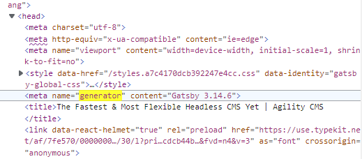
One of the most powerful tools for this is Agile CMS.
5. Be Consistent with Your Brand and Messaging
When it comes to the B2B market, branding is one of the most important aspects you need to consider.
Your brand is how your company is perceived by potential and current customers. It's what makes you unique and different from your competitors.
It's also what helps buyers remember you, even after they've left your website.
This is why it's so important to be consistent with your branding and messaging across all channels, including your website.
Make sure that your website's design, colors, fonts, and copy are aligned with your company's branding guidelines.
Use the same logo, colors, and fonts on all of your marketing materials, so buyers will recognize you when they see you online or offline. See Agility CMS, for example:
They use a consistent use of branding color and custom graphics, from their homepage to their landing pages. This consistency doesn't only make the website more elegant but also looks much easier on the eyes.
You might need to avoid designing your website in a silo because it can be difficult to coordinate and track all the different moving parts. This can lead to inconsistency in your branding and messaging.
Instead, try to use a collaborative design process where you involve different members of your team, such as marketing, sales, and customer service. This will help ensure that everyone is on the same page and your branding and messaging are consistent across all channels.
And most importantly, make sure that your messaging is clear and consistent. Use the same keywords and phrases on your website, marketing materials, and social media profiles.
6. Test, Launch, and Review
Just when you are pretty satisfied and proud with your B2B website, how do you know that your visitors and potential buyers think the same way?
The only way to find out is by launching your website and testing it with real users.
No matter how good your website is, there will always be room for improvement. That's why it's important to test different aspects of your website and see what works and what doesn't.
The most common issue that many visitors face when they visit a B2B website is that it has a bad layout, buggy, or slow pages to load.
- Inspect design elements for errors and inconsistencies.
- Check all links and make sure they're working. Fix any 404s.
- Reduce videos and images size for a faster page loading.
- Ensure that all forms and buttons are working properly.
- Make sure your website is accessible from any device or screen size.
- Use a tool like Google's PageSpeed Insights to help you identify potential issues with your website.
You can also use a variety of tools and techniques for testing, such as surveys, interviews, focus groups, and usability tests.
Once you have some feedback from your test users, make the necessary changes and launch a new version of your website. Then repeat the process until you're happy with the results.
7. Audit Your Current Website and Its Content
Keep in mind that website design is never really finished, it's always a work-in-progress. So make sure to review your website on a regular basis and update it as needed.
One of the best ways to do this is by conducting an audit of your current website and its content. This will help you identify any areas that need improvement and help you come up with a plan for updating your website's design, content, and functionality.
There are a variety of different tools to help you conduct an audit of your websites, such as Google Analytics, Woorank, and HubSpot's Website Grader.
Once you have the results of your audit, make a plan for updating your website and then implement those changes over time. This will help ensure that your website is always up-to-date and delivers the best possible experience to your visitors.
It's Time to Create Your High-Converting B2B Website
The key to a high-performing B2B website creation process is to put the visitor or potential buyer at the center of it.
That way, you can be sure that all your design decisions are made with their needs in mind. As a result, you can drive impactful experiences that lead to growth, trust, and long-lasting customer relationships.
By considering these tips mentioned above, you'll be on your way to creating a B2B website that will help you achieve your business goals.

About the Author
Andre Oentoro is the founder of Breadnbeyond, an award-winning explainer video company. He helps businesses increase conversion rates, close more sales, and get positive ROI from explainer videos (in that order).
Twitter: @breadnbeyond
Email: andre@breadnbeyond.com
LinkedIn: Andre Oentoro
View Related Resources

5 Digital Marketing Strategies B2B Can Learn from B2C


