What is your developer-dependent CMS actually costing you? Calculate your costs and get a full report
Introducing Plenum UI: Enhance Your Agility Ecosystem with Our Open Source UI Library
Welcome to Plenum UI, the definitive, collaborative and open source UI library for working within the Agility ecosystem!

What is Plenum UI and Where Do I Find It?
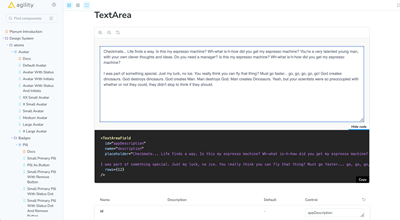
Built with Next.js 13 and Storybook 7.1, Plenum UI is a comprehensive collection of components and patterns designed for building user interfaces in Agility, as well as your own applications within the Agility ecosystem.
You can access and bookmark Plenum UI at the link below:
Building for the Agility Marketplace
The Plenum UI library is designed to encourage and facilitate building Apps for the Agility Marketplace. Feel free to fully utilize the rich selection of components and patterns we provide to build consistent, robust, and user-friendly Apps for the Agility ecosystem.
Features
- Comprehensive UI Components library, designed for versatility and consistency
- Built with modern technologies like Next.js 13 and Storybook 7.1
- Includes automation scripts for efficient component creation
- Adopts Tailwind CSS for utility-first styling
- Easy to use, install, and integrate into your project
Prerequisites
Before you begin, ensure that Tailwind CSS is installed in your project. Follow the instructions here: Install Tailwind CSS with Next.js
1. In your app entry point (i.e. `_app.tsx`), import the globals.cssfile from the previous step, and the tailwind.css file from Plenum:
import "<RELATIVE_PATH>/globals.css";
import "@agility/plenum-ui/lib/tailwind.css";
2. Make sure to add any additional styles before these two import statements to prevent overwriting the Plenum styling.
Installation
You can install the Plenum UI library using npm or yarn:
# Using npm:
npm install @agility/plenum-ui

# Using yarn:
yarn add @agility/plenum-ui
Usage
Import and use the Plenum UI components in your React components:
import { Component } from '@agility/plenum-ui';

<Component {...{ComponentProps}} />
Scripts
Build and Development Scripts
Run your development server with Storybook:
npm run dev
# or
yarn dev
Build your project:
npm run build
# or
yarn build
Clean the `dist` directory:
npm run clean
# or
yarn clean
Lint your project:
npm run lint
# or
yarn lint
Build Tailwind CSS:
npm run build:tw
# or
yarn build:tw
Storybook Scripts
Build your Storybook:
npm run build-storybook
# or
yarn build-storybook
Run your Storybook in development mode:
npm run storybook:dev
# or
yarn storybook:dev
Generate Tailwind CSS for Storybook and watch for changes:
npm run storybook:tw
# or
yarn storybook:tw
Build specific parts of Storybook:
# Build Storybook
npm run sb-build:storybook
# or
yarn sb-build:storybook

# Build Tailwind CSS for Storybook
npm run sb-build:tw
# or
yarn sb-build:tw
Compile TypeScript files using custom build script:
npm run build:tsc
# or
yarn build:tsc
These scripts cover various tasks related to development, build processes, linting, and handling specific aspects like Storybook and Tailwind CSS. Make sure to run the appropriate script for the task you want to perform.
Component Generation Script
We have a Node.js script that automates the creation of new components for our Storybook library. This script generates a component directory, along with the necessary files like `Component.tsx`, `Component.stories.tsx`, and `index.tsx`.
How to use the script
To use the script, you should have Node.js installed. From the terminal, you can create a new component by running the following command:
node create-component.js ComponentName DestinationDirectoryThis command takes two arguments:
ComponentName- The name of the new component you want to create. This should be in PascalCase (for example, "MyComponent").DestinationDirectory- The directory where the new component will be created. This should be relative to the 'stories' directory. (for example, "atoms" or "Molecules").
The script will create a new directory with the given component name inside the specified destination directory (under the 'stories' directory). Then, it will generate three files in the new directory:
ComponentName.tsx- This is the component file. It contains a basic React functional component structure.ComponentName.stories.tsx- This is the Storybook story file. It sets up a basic story for the new component.index.tsx- This file simply exports the new component. It's used for cleaner imports.
Example
To create a new component named "Button" in the "atoms" directory, you would run:
node create-component.js Button atomsThis would create a directory structure like:
- stories
  - atoms
    - Button
      - Button.tsx
      - Button.stories.tsx
      - index.tsx
Each of the generated files will contain basic boilerplate code that you can start with.
Note
This script does prompt the user before overwriting existing directories, so you can run it with confidence. Always use PascalCase for component names, and ensure destination directory exists or can be created. If you encounter any issues, you can create the component and its files manually.
Contributing to Plenum UI
Contributions to extend and improve this library are encouraged and welcome! Feel free to fork the repo and submit pull requests.
Further Reading